The aim of this document is to:
-
Explain what OperatorFabric is about and define the concepts it relies on
-
Give a basic tour of its features from a user perspective
1. Introduction
To perform their duties, an operator has to interact with multiple applications (perform actions, watch for alerts, etc.), which can prove difficult if there are too many of them.
The idea is to aggregate all the notifications from all these applications into a single screen, and to allow the operator to act on them if needed.
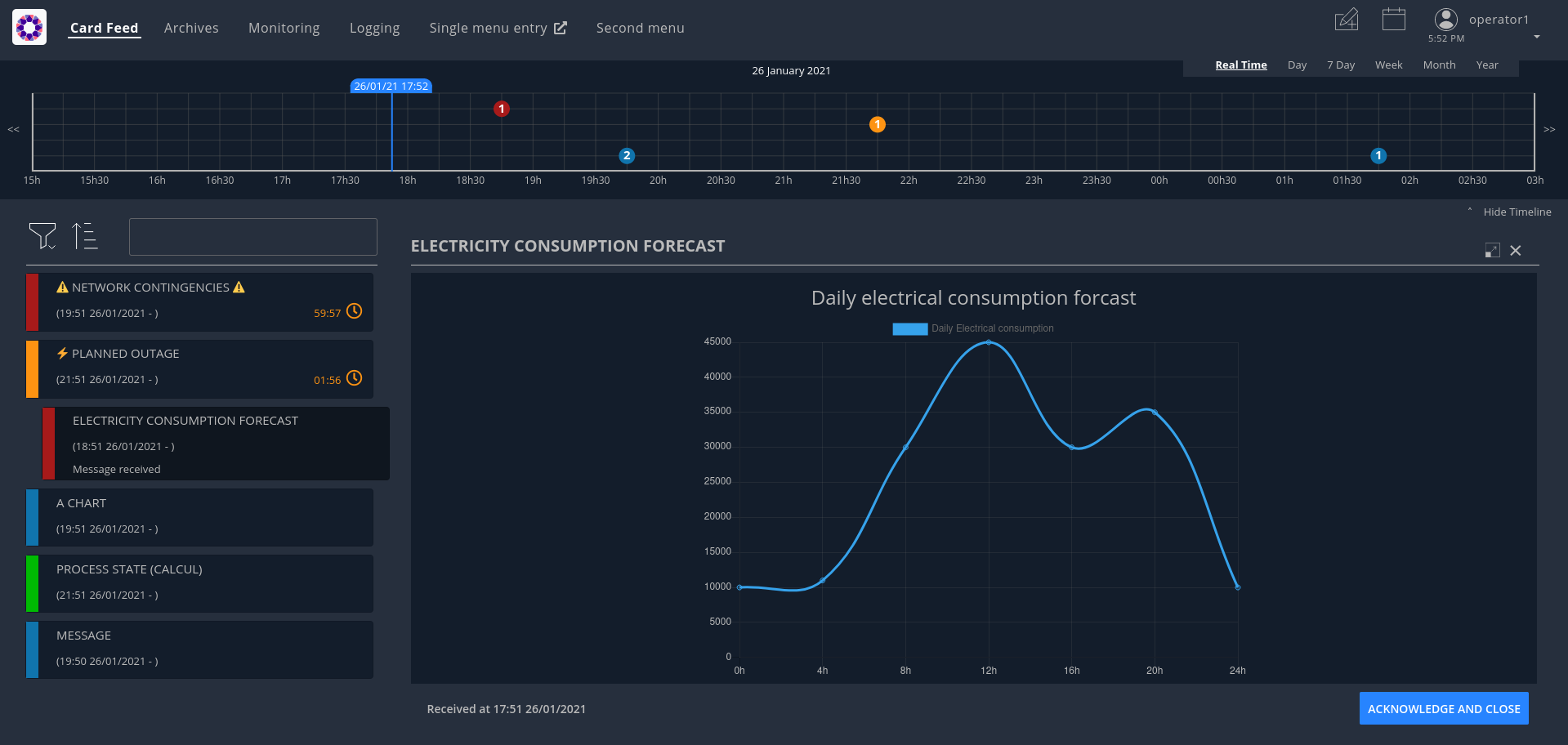
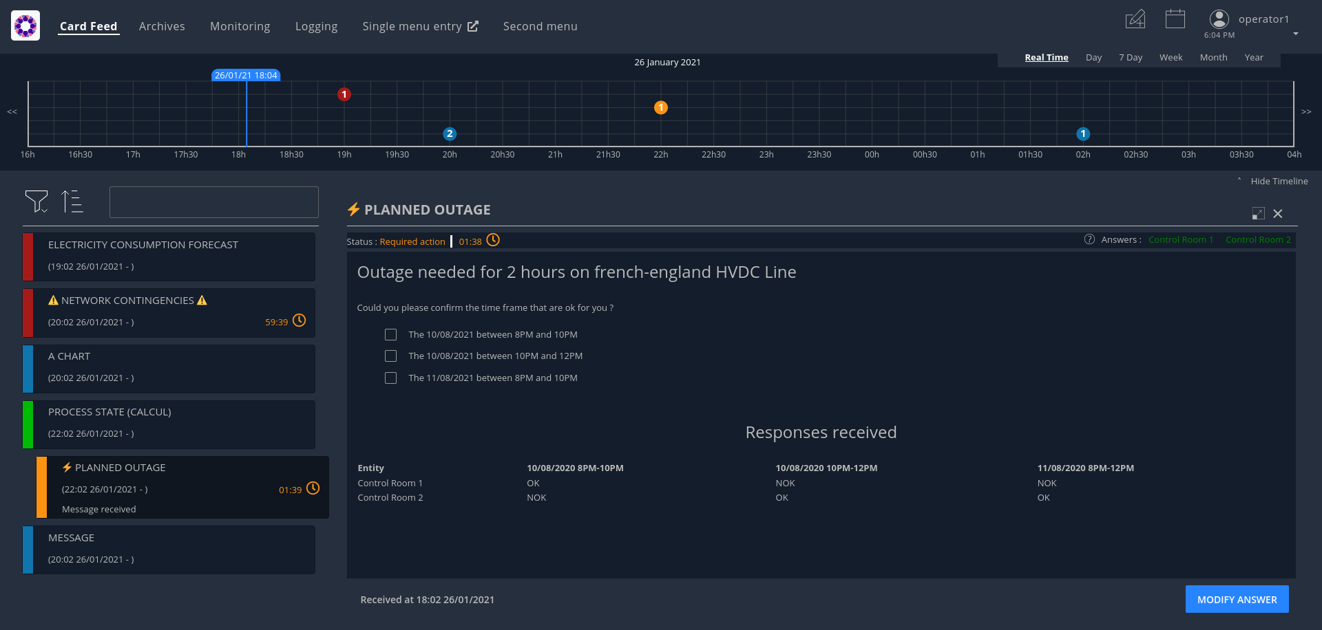
These notifications are materialized by cards sorted in a feed according to their period of relevance and their severity. When a card is selected in the feed, the right-hand pane displays the details of the card.
In addition, the cards will also translate as events displayed on a timeline at the top of the screen.
Part of the value of OperatorFabric is that it makes the integration very simple on the part of the third-party applications. To start publishing cards to users in an OperatorFabric instance, all they have to do is:
-
Register as a publisher through the "Businessconfig" service and provide a "bundle" containing handlebars templates defining how cards should be rendered, i18n info etc.
-
Publish cards as json containing card data through the card publication API
OperatorFabric will then:
-
Dispatch the cards to the appropriate users (by computing the actual users who should receive the card from the recipients rules defined in the card)
-
Take care of the rendering of the cards
-
Display relevant information from the cards in the timeline
A card is not only information, it could be question(s) the operator has to answer. When the operator is responding, a card is emitted to the sender of the initial card and the response could be seen by other operators.
It is also possible for users to directly send card to other users using predefined card templates.
OperatorFabric user interface is running on a browser (recent version of chrome, firefox and edge are supported).
The supported screen resolutions are :
-
Resolutions greater than or equals to 1680x1050.
-
Resolutions with a width between 450-900px and a minimum height of 700px.
2. Sending cards
The Cards Publication Service exposes a REST API through which third-party applications, or "publishers" can post cards to OperatorFabric. It then handles those cards:
-
Time-stamping them with a "publishDate"
-
Sending them to the message broker (RabbitMQ) to be delivered in real time to the appropriate operators
-
Persisting them to the database (MongoDB) for later consultation
The maximum size of a card is 1.5 Mb. This limit is enforced to avoid bloating the mongo database and for performance reasons.
2.1. Card Structure
Cards are represented as Json objects. The technical design of cards is described in
the cards api documentation
. A card correspond to the state of a Process in OperatorFabric.
2.1.1. Technical Information of the card
Those attributes are used by OperatorFabric to manage how cards are stored, to whom and when they’re sent.
2.1.1.1. Mandatory information
Below, the json technical key is in the '()' following the title.
Publisher (publisher)
The publisher field bears the identifier of the emitter of the card, be it an entity or an external service.
Process (process)
This field indicates which process the card is attached to. This information is used to resolve the presentation resources (bundle) used to render the card and card details.
| The use of '/','#' or '?' in process field is forbidden. |
Process Version (processVersion)
The rendering of cards of a given process can evolve over time. To allow for this while making sure previous cards
remain correctly handled, OperatorFabric can manage several versions of the same process.
The processVersion field indicate which version of the process should be used to retrieve the presentation resources
(i18n, templates, etc.) to render this card.
Process Instance Identifier (processInstanceId)
A card is associated to a given process, which defines how it is rendered, but it is also more precisely associated to
a specific instance of this process. The processInstanceId field contains the unique identifier of the process instance.
| The use of '/' in the processInstanceId field is forbidden. |
State in the process (state)
The card represents a specific state in the process. In addition to the process, this information is used to resolve the presentation resources used to render the card and card details.
Severity (severity)
The severity is a core principle of the OperatorFabric Card system. There are 4 severities available. A color is associated in the GUI to each severity. Here the details about severity and their meaning for OperatorFabric:
-
ALARM: represents a critical state of the associated process, need an action from the operator. In the UI, the card is red;
-
ACTION: the associated process need an action form operators in order to evolve correctly. In the UI, the card is orange;
-
COMPLIANT: the process related to the card is in a compliant status. In the UI, the card is green.;
-
INFORMATION: give information to the operator. In the UI, the card is blue.
2.1.1.2. Optional information
Expiration Date (expirationDate)
Expiration date of the active period of the card (process business time). When the expiration date has passed, the card will be automatically removed from the card feed.
Tags (tag)
Tags are intended as an additional way to filter cards in the feed of the GUI.
| Grouping cards is an experimental feature |
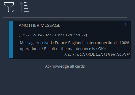
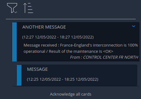
Tags can also be used to group cards together in the card feed. When feed.enableGroupedCards is enabled in the web-ui.json configuration file, cards that have the same tags are grouped together. In the feed window, only the top card will be visible and can be clicked to show cards with the same tags.
EntityRecipients (entityRecipients)
Used to send cards to entity : all users members of the listed entities who have the right for the process/state of the card will receive it.
GroupRecipients (groupRecipients)
Used to send cards to groups : all users members of the groups will receive it. If this field is used in conjunction with entityRecipients, to receive the cards :
-
users must be members of one of the entities AND one of the groups to receive the cards.
OR
-
users must be members of one of the entities AND have the right for the process/state of the card.
UserRecipients (userRecipients)
Used to send cards directly to users without using groups or entities for card routing.
Last Time to Decide (lttd)
Fixes the moment until when a response is possible for the card. After this moment, the response button won’t be usable. When lttd time is approaching, a clock is visible on the card in the feed with the residual time. The lttd time can be set for cards that don’t expect any response
SecondsBeforeTimeSpanForReminder (secondsBeforeTimeSpanForReminder)
Fixes the time for remind before the event define by the card see Card reminder
Publisher type (publisherType)
-
EXTERNAL - The sender is an external service
-
ENTITY - The sender of the card is the user on behalf of the entity
Representative (representative)
Used in case of sending card as a representative of an entity or a publisher (unique ID of the entity or publisher)
Representative Type (representativeType)
-
EXTERNAL - The representative is an external service
-
ENTITY - The representative is an entity
Geographical information (wktGeometry and wktProjection)
You can add geographical location in wktGeometry and the projection in wktProjection fields.
When feed.geomap.enableMap is enabled in the web-ui.json configuration file and the card is visible in the line feed, a geographical map will be drawn. When the card has set its wktGeometry, the location will be highlighted on the card. Two geometrical shapes are supported POINT, which will show a circle on the map, and POLYGON which will draw the specified area on the map. For example show a circle based on the card location:
"wktGeometry": "POINT (5.8946407 51.9848624)",
"wktProjection": "EPSG:4326",
Example to highlight an area on the map:
"wktGeometry": "POLYGON ((5.5339097 52.0233042,  5.7162495 51.7603784, 5.0036701 51.573684, 4.8339214 52.3547498, 5.5339097 52.0233042))",
"wktProjection": "EPSG:4326",
The specifications of the Well-known Text Representation of coordinate reference systems can be found at WKT Specification.
| Only the POINT and POLYGON are supported. |
Actions (actions)
A list of predetermined actions that will be executed upon receiving the card. The available actions include:
-
KEEP_CHILD_CARDS : used to keep child cards when the parent card is modified.
-
PROPAGATE_READ_ACK_TO_PARENT_CARD : used only for response cards. When receiving the child card, the status of the parent card should be considered as 'unread' and 'not acknowledged' until the user reads or acknowledge it again.
-
KEEP_EXISTING_ACKS_AND_READS : used to keep existing reads and acks when updating a card
-
STORE_ONLY_IN_ARCHIVES : used to store the card only in archivedCards collection and not in cards collection. No notification will be sent to UI, so the card will not be displayed in the feed.
-
NOT_NOTIFIED : when this action is set, the card is not visible in the card feed except for the publisher but it is visible in all the other screens: custom screens / agenda / timeline. The card is visible in the feed when the card will be reminded.
2.1.1.3. Business period
We define the business period as starting form startDate to endDate. The card will be visible on the UI if the business period overlaps the user chosen period (i.e. the period selected on the timeline). If endDate is not set, the card will be visible as soon as the startDate is between start and end date of the chosen period.
2.1.1.4. Store information
uid (uid)
Unique identifier of the card in the OperatorFabric system. This attribute is always set by OperatorFabric.
2.1.2. User intended Information of the card
There are two kind of User intended information in a card. Some are restricted to the card format, others are defined by the publisher as long as there are encoded in json format.
2.1.3. Presentation Information of the card
2.1.3.1. TimeSpans (timeSpans)
When the simple startDate and endDate are not enough to characterize your process business times, you can add a list of TimeSpan to your card. TimeSpans are rendered in the timeline component as cluster bubbles. This has no effect on the feed content.
example :
to display the card two times in the timeline you can add two TimeSpan to your card:
{
	"publisher":"Dispatcher",
	"publisherVersion":"0.1",
	"process":"process",
	"processInstanceId":"process-000",
	"startDate":1546297200000,
	"severity":"INFORMATION",
	...
	"timeSpans" : [
        {"start" : 1546297200000},
        {"start" : 1546297500000}
    ]

}
In this sample, the card will be displayed twice in the timeline. The card start date will be ignored.
For timeSpans, you can specify an end date, but it is not implemented in OperatorFabric (it was intended for future uses, but it will be deprecated).
2.2. Cards Examples
Before detailing the content of cards, let’s show you what cards look like through few examples of json.
2.2.1. Minimal Card
The OperatorFabric Card specification defines mandatory attributes, but some optional attributes are needed for cards to be useful in OperatorFabric. Let’s clarify those point through few examples of minimal cards and what happens when they’re used as if.
2.2.1.1. Rules for receiving cards
Whatever the recipient(s) of the card (user directly, group and/or entity), the user must have the receive right on the process/state of the card to receive it (Receive or ReceiveAndWrite).
So the rules for receiving cards are :
1) If the card is sent to user1, the card is received and visible for user1 if he has the receive right for the corresponding process/state
2) If the card is sent to GROUP1 (or ENTITY1_FR), the card is received and visible for user if all the following is true :
-
he’s a member of GROUP1 (or ENTITY1_FR)
-
he has the receive right for the corresponding process/state
3) If the card is sent to ENTITY1_FR and GROUP1, the card is received and visible for user if all the following is true :
-
he’s a member of ENTITY1_FR (either directly or through one of its children entities)
-
he’s a member of GROUP1
-
he has the receive right for the corresponding process/state
In this chapter, when we talk about receive right, it means Receive or ReceiveAndWrite.
2.2.1.2. Send to One User
The following card contains only the mandatory attributes.
{
	"publisher":"TEST_PUBLISHER",
	"processVersion":"0.1",
	"process":"process",
	"processInstanceId":"process-000",
	"state":"myState",
	"startDate":1546297200000,
	"severity":"INFORMATION",
	"title":{"key":"card.title.key"},
	"summary":{"key":"card.summary.key"},
	"userRecipients": ["operator1_fr"]

}
This an information about the process instance process-000 of process process, sent by TEST_PUBLISHER. The title and the summary refer to i18n keys
defined in the associated i18n file of the process. This card is displayable since the first january 2019 and
should only be received by the user using the operator1_fr login (provided that this user has receive right on this process/state).
2.2.1.3. Send to several users
Simple case (sending to a group)
The following example is nearly the same as the previous one except for the recipient.
{
	"publisher":"TEST_PUBLISHER",
	"processVersion":"0.1",
	"process":"process",
	"processInstanceId":"process-000",
	"state":"myState",
	"startDate":1546297200000,
	"severity":"INFORMATION",
	"title":{"key":"card.title.key"},
	"summary":{"key":"card.summary.key"},
	"groupRecipients": ["Dispatcher"]
}
Here, the recipient is a group, the Dispatcher. So all users who are members of this group and who have receive right on the process/state of the card will receive it.
Simple case (sending to an entity)
The following example is nearly the same as the previous one except for the recipient.
{
	"publisher":"TEST_PUBLISHER",
	"processVersion":"0.1",
	"process":"process",
	"processInstanceId":"process-000",
	"state":"myState",
	"startDate":1546297200000,
	"severity":"INFORMATION",
	"title":{"key":"card.title.key"},
	"summary":{"key":"card.summary.key"},
	"entityRecipients" : ["ENTITY1_FR"]
}
Here, the recipient is an entity, ENTITY1_FR, and there is no group recipient anymore. So all users who are members of this entity and who have a receive right for the process/state of the card will receive it. More information on perimeters can be found in
user documentation
Example : Given this perimeter :
{
    "id" : "perimeter1",
    "process" : "process",
    "stateRights" : [
        {
            "state" : "myState",
            "right" : "Receive"
        },
        {
            "state" : "myState2",
            "right" : "ReceiveAndWrite"
        }
    ]
}
Given this group :
{
    "id": "group1",
    "name": "group number 1",
    "description": "group number 1 for documentation example"
}
Perimeters can only be linked to groups, so let’s link the perimeter perimeter1 to the group group1. You can do this with this command line for example ($token is your access token) :
curl -X PUT http://localhost:2103/perimeters/perimeter1/groups -H "Content-type:application/json" -H "Authorization:Bearer $token" --data "[\"group1\"]"
Then you can see group1 is now :
{
    "id": "group1",
    "name": "group number 1",
    "description": "group number 1 for documentation example",
    "perimeters": ["perimeter1"]
}
If the connected user is a member of group1, then he has a Receive right on process/state
process/myState (and also on`process/myState2`). So if the user is also a member of ENTITY1_FR
then he will receive the card.
Simple case (sending to a group and an entity)
The following example is nearly the same as the previous one except for the recipient.
{
	"publisher":"TEST_PUBLISHER",
	"processVersion":"0.1",
	"process":"process",
	"processInstanceId":"process-000",
	"state":"myState",
	"startDate":1546297200000,
	"severity":"INFORMATION",
	"title":{"key":"card.title.key"},
	"summary":{"key":"card.summary.key"},
	"groupRecipients": ["Dispatcher"],
	"entityRecipients" : ["ENTITY1_FR"]
}
Here, the recipients are a group and an entity, the Dispatcher group and ENTITY1_FR entity. To receive the card, the user must be a member of both ENTITY1_FR and GROUP1 and must have the receive right for the corresponding process/state.
Complex case
If this card need to be viewed by a user who is not in the Dispatcher group, it’s possible to tune more precisely the
definition of the recipient. If the operator2_fr needs to see also this card, the recipient definition could be(the following code details only the recipient part):
"groupRecipients": ["Dispatcher"],
"userRecipients": ["operator2_fr"]
So here, all the users of the Dispatcher group will receive the INFORMATION as should the tos2-operator user.
Another example, if a card is destined to the operators of Dispatcher and Planner and needs to be also seen by the admin, the recipient configuration looks like:
"groupRecipients": ["Dispatcher", "Planner"],
"userRecipients": ["admin"]
2.2.2. Regular Card
The previous cards were nearly empty regarding information carrying. In fact, cards are intended to contain more information than a title and a summary. The optional attribute data is here for that. This attribute is destined to contain any json object. The creator of the card is free to put any information needed as long as it’s in a json format.
2.2.2.1. Full of Hidden data
For this example we will use our previous example for the Dispatcher group with a data attribute containing the definition of a json object containing two attributes: stringExample and numberExample.
{
	"publisher":"TEST_PUBLISHER",
	"processVersion":"0.1",
	"process":"process",
	"processInstanceId":"process-000",
	"state":"myState",
	"startDate":1546297200000,
	"severity":"INFORMATION",
	"title":{"key":"card.title.key"},
	"summary":{"key":"card.summary.key"},
	"userRecipients": ["operator1_fr"],
	"data":{
		"stringExample":"This is a not so random string of characters.",
		"numberExample":123
		}

}
This card contains some data but when selected in the feed nothing more than the previous example of card happen because there is no rendering configuration.
2.2.2.2. Fully useful
When a card is selected in the feed (of the GUI), the data is displayed in the detail panel. The way details are formatted depends on the template contained in the bundle associated with the process as described here . To have an effective example without too many actions to perform, the following example will use an already existing configuration. You can find the corresponding bundle of the following example in the test directory of OperatorFabric (tests/resources/bundles).
At the card level, the attributes in the card telling OperatorFabric which template to use are the process and state
attributes, the templateName can be retrieved from the definition of the bundle.
{
	"publisher":"TEST_PUBLISHER",
	"processVersion":"1",
	"process":"defaultProcess",
	"processInstanceId":"process-000",
	"state":"messageState",
	"startDate":1546297200000,
	"severity":"INFORMATION",
	"title":{"key":"message.title"},
	"summary":{"key":"message.summary"},
	"userRecipients": ["operator1_fr"],
	"data":{"message":"Data displayed in the detail panel"},

}
So here a single custom data is defined, and it’s message. This attribute is used by the template called by the
templateName attribute.
2.3. Patching cards
The Cards Publication Service exposes a REST API endpoint through which a card can be patched.
You can find more information in
the cards publication api documentation
. For example, fields like severity, title, summary or data etc… can be patched. However, the fields process and
processInstanceId can not be patched as they are used to identify the card.
3. Card rendering
As stated above, third applications interact with OperatorFabric by sending cards.
The Businessconfig service allows them to tell OperatorFabric for each process how these cards should be rendered including translation if several languages are supported. Configuration is done via files zipped in a "bundle", these files are send to OperatorFabric via a REST end point.
In addition, it lets third-party applications define additional menu entries for the navbar (for example linking back to the third-party application) that can be integrated either as iframe or external links.
3.1. Process: Declaration and Configuration
To declare and configure a Process, OperatorFabric uses bundles.
This section describes their content and how to use them.
An OperatorFabric Process is a way to define a business configuration.
Once this bundle fully created, it must be uploaded to the server through the Businessconfig service.
Some examples show how to configure a process using a bundle before diving in more technical details of the configuration.
The following instructions describe tests to perform on OperatorFabric to understand how customizations are possible.
3.1.1. Bundle as Process declaration
A bundle contains all the configuration regarding a given business process, describing for example the various steps of the process but also how the associated cards and card details should be displayed.
Bundle are technically tar.gz archives containing at least a descriptor file named config.json.
To display the card date, some css files, i18n file and handlebars templates must be added.
For didactic purposes, in this section, the businessconfig bundle name is BUNDLE_TEST (to match the parameters used by the script).
The l10n (localization) configurations is English.
As detailed in the Businessconfig core service README the bundle contains at least a metadata file called config.json, a file i18n.json, a css folder and a template folder.
Except for the config.json file, all elements are optional.
The file organization within a bundle:
bundle
├── config.json
├── i18n.json
├── css
│   └── bundleTest.css
└── template
    ├── template1.handlebars
    └── template2.handlebars
3.1.2. The config.json file
It’s a description file in json format.
It lists the content of the bundle.
example
{
  "id": "TEST",
  "version": "1",
  "uiVisibility": {
    "monitoring": true,
    "logging": true,
    "calendar": true
  },
  "name": "process.label",
  "defaultLocale": "fr",
  "states": {
    "firstState": {
      "name":  "state.label",
      "color": "blue",
      "templateName": "operation",
      "acknowledgmentAllowed": "Never"
    }
  }
}-
id: id of the process; -
name: process name; -
version: enables the correct display of the card data, even for the old ones. The server stores the previous versions in its file system. This field value should match a businessconfig configuration for a correct rendering; -
states: lists the available states which each declares associated actions, associated templates and if cards could be acknowledged by users; -
uiVisibility: in the logging and calendar screens, not all the cards are visible, it depends on the business process they are part of. For a card to be visible in these screens, the corresponding parameter must be set to true.
The mandatory field are id,name and version.
See the Processes API documentation for details.
3.1.3. The i18n.json file
This file contains internationalization information, in particular the translation for title and summary fields
If there is no i18n file or key is missing, OperatorFabric displays i18n key, such as BUNDLE_TEST.1.missing-i18n-key.
In the case where the bundle declares no i18n key corresponds to missing-i18n-key.
The choice of i18n keys is up to the maintainer of the Businessconfig process.
3.1.3.1. Template folder
The template folder contains one template file for each process/state. They will be used for the card details rendering.
Example
For this example, the name of the process is Bundle Test and its technical name is BUNDLE_TEST.
The bundle provides an english l10n.
Title and summary have to be localized.
Here is the content of i18n.json
{
  "TEST": {
    "title": "Test: Process {{value}}",
    "summary": "This sums up the content of the card: {{value}}",
    "detail": {
      "title": "card title"
    }
  },
  "process": {
    "label": "Test Process"
  },
  "state": {
    "label": "Test State"
  },
  "template": {
    "title": "Asset details"
  }
}
To check the i18n, after the upload of the bundle, use a GET request against the businessconfig service.
The simpler is to ask for the i18n file, as described
here
.
Set the version of the bundle and the technical name of the businessconfig party to get json in the response.
For example, to check if the french l10n data of the version 1 of the BUNDLE_TEST businessconfig party use the following command line:
curl "http://localhost:2100/businessconfig/processes/BUNDLE_TEST/i18n?version=1" \
-H  "Authorization: Bearer ${token}"
where ${token} is a valid token for OperatorFabric use.
The businessconfig service should answer with a 200 status associated with the following json:
{
  "TEST": {
    "title": "Test: Process {{value}}",
    "summary": "This sums up the content of the card: {{value}}",
    "detail": {
      "title": "card title"
    }
  },
  "process": {
    "label": "Test Process"
  },
  "state": {
    "label": "Test State"
  },
  "template": {
    "title": "Asset details"
  }
}
3.1.3.2. Processes and States
Each Process declares associated states. Each state declares specific templates for card details and specific actions.
The purpose of this section is to display elements of businessconfig card data in a custom format.
configuration
The process entry in the configuration file is a dictionary of processes, each key maps to a process definition. A process definition is itself a dictionary of states, each key maps to a state definition.
Templates
For demonstration purposes, there will be two simple templates.
For more advance feature, go to the section detailing the handlebar templates and associated helpers available in OperatorFabric.
As the card used in this example is created above, the bundle template folder needs to contain 2 templates: template1.handlebars and template2.handlebars.
Examples of template (i18n versions)
The following template displays a title and a line containing the value of the scope property card.level1.level1Prop.
The value of this key is 'This is a root property'.
/template/template1.handlebars
<h2>Template Number One</h2>
<div class="bundle-test">'{{card.data.level1.level1Prop}}'</div>
The following template example displays also a title and a list of numeric values from 1 to 3.
/template/template2.handlebars
<h2>Second Template</h2>
<ul class="bundle-test-list">
        {{#each card.data.level1.level1Array}}
                <li class="bunle-test-list-item">{{this.level1ArrayProp}}</li>
        {{/each}}
</ul>
CSS
This folder contains regular css files.
The file name must be declared in the config.json file in order to be used in the templates and applied to them.
As above, all parts of files irrelevant for our example are symbolised by a … character.
Declaration of css files in config.json file
{
        …
    "states" : {
            "state1" : {
                  …
                        "styles":["bundleTest"]
                  }
              }
        …
}
CSS Class used in ./template/template1.handlebars
        …
        <div class="bundle-test">'{{card.data.level1.level1Prop}}'</div>
        …
As seen above, the value of {{card.data.level1.level1Prop}} of a test card is This is a level1 property
Style declaration in ./css/bundleTest.css
.h2{
        color:#fd9312;
        font-weight: bold;
}
Expected result

3.1.3.3. Upload
To upload a bundle to the OperatorFabric server use a POST http request as described in the
Processes API documentation
.
Example
cd ${BUNDLE_FOLDER}
curl -X POST "http://localhost:2100/businessconfig/processes"\
        -H  "accept: application/json"\
        -H  "Content-Type: multipart/form-data"\
        -F "file=@bundle-test.tar.gz;type=application/gzip"
Where:
-
${BUNDLE_FOLDER}is the folder containing the bundle archive to be uploaded. -
bundle-test.tar.gzis the name of the uploaded bundle.
These command line should return a 200 http status response with the details of the bundle in the response body such as :
{
  "id":"BUNDLE_TEST"
  "name": "BUNDLE_TEST",
  "version": "1",
  "states" : {
          "start" : {
            "templateName" : "template1"
          },
          "end" : {
            "templateName" : "template2",
            "styles" : [ "bundleTest.css" ]
          }
      }
}
For further help check the Troubleshooting section which resumes how to resolve common problems.
3.1.4. Processes groups
OperatorFabric offers the possibility of defining process groups. These groups have an impact only on the UI, for example on the notification configuration screen, by offering a more organized view of all the processes.
| A process can only belong to one process group. |
To define processes groups, you have to upload a file via a POST http request as described in the
Example
cd ${PROCESSES_GROUPS_FOLDER}
curl -X POST "http://localhost:2100/businessconfig/processgroups"\
        -H "accept: application/json"\
        -H "Content-Type: multipart/form-data"\
        -F "file=@processesGroups.json"\
        -H "Authorization: Bearer ${token}"
Where:
-
${PROCESSES_GROUPS_FOLDER}is the folder containing the processes groups file to upload. -
processesGroups.jsonis the name of the uploaded file. -
${token}is a valid token for OperatorFabric use.
Example of content for uploaded file :
{
  "groups": [
    {
      "id": "processgroup1",
      "name": "Process Group 1",
      "processes": [
        "process1",
        "process2"
      ]
    },
    {
      "id": "processgroup2",
      "name": "Process Group 2",
      "processes": [
        "process3",
        "process4"
      ]
    }
  ]
}
These command line should return a 201 http status.
3.2. Templates
Templates are Handlebars template files. Templates are then filled with data coming from two sources:
-
a card property (See card publication API for more information)
-
a userContext :
-
login: user login
-
token: user jwt token
-
firstName: user first name
-
lastName: user last name
-
groups : user groups as an array of groups ID
-
entities : user entities as an array of entities ID
-
To use these data in the template , you need to reference them inside double braces. For example if you want to display the user login:
Your login is : {{userContext.login}}To display specific business data from the card, write for example:
My data : {{card.data.mydataField}}Have a look to handlebarsjs.com/ for more information on the templating mechanism.
In addition to Handlebars basic syntax and helpers, OperatorFabric defines the following helpers :
3.2.1. OperatorFabric specific handlebars helpers
3.2.1.1. arrayContains
Verify if an array contains a specified element. If the array does contain the element, it returns true. Otherwise, it returns false.
<p {{#if (arrayContains colors 'red')}}class="text-danger"{{/if}}>test</p>
If the colors array contains 'red', the output is:
<p class="text-danger">test</p>
3.2.1.2. arrayContainsOneOf
If the first array contains at least one element of the second array, return true. Otherwise, return false.
{{#if (arrayContainsOneOf arr1 arr2)}}
  <p>Arr1 contains at least one element of arr2</p>
{{/if}}
3.2.1.3. bool
returns a boolean result value on an arithmetical operation (including object equality) or boolean operation.
Arguments: - v1: left value operand - op: operator (string value) - v2: right value operand
arithmetical operators:
-
==
-
===
-
!=
-
!==
-
<
-
⇐
-
>
-
>=
boolean operators:
-
&&
-
||
examples:
{{#if (bool v1 '<' v2)}}
  v1 is strictly lower than v2
{{else}}
 V2 is lower or equal to v1
{{/if}}
3.2.1.4. conditionalAttribute
Adds the specified attribute to an HTML element if the given condition is truthy.
This is useful for attributes such as checked where it is the presence or absence of the attribute that matters (i.e.
an checkbox with checked=false will still be checked).
<input type="checkbox" id="optionA" {{conditionalAttribute card.data.optionA 'checked'}}></input>
3.2.1.5. replace
Replaces all the occurrences in a given string You should specify the substring to find, what to replace it with and the input string.
{{replace "<p>" "<p>" this.value}}
3.2.1.6. dateFormat
formats the submitted parameters (millisecond since epoch) using date-fns format. The locale used is the current user selected one, the format is "format" hash parameter (see Handlebars doc Literals section).
{{dateFormat card.data.birthday format="MMMM Do yyyy, h:mm:ss a"}}
Note
You can also pass a milliseconds value as a string.
{{dateFormat card.data.birthdayAsString format="MMMM Do yyyy, h:mm:ss a"}}
3.2.1.7. json
Convert the element in json, this can be useful to use the element as a javascript object in the template. For example :
var myAttribute = {{json data.myAttribute}};
3.2.1.8. keepSpacesAndEndOfLine
Convert a string to a light HTML by replacing :
-
each new line character with <br/>
-
spaces with when there is at least two consecutive spaces.
3.2.1.9. keyValue
This allows to traverse a map.
Notice that this should normally be feasible by using the built-in each helper, but a client was having some troubles using it so we added this custom helper.
{{#keyValue studentGrades}}
  <p> {{index}} - {{key}}: {{value}} </p>
{{/keyValue}}
If the value of the studentGrades map is:
{
  'student1': 15,
  'student2': 12,
  'student3': 9
}
The output will be:
<p> 0 - student1: 15</p>
<p> 1 - student2: 12</p>
<p> 2 - student3: 9</p>
3.2.1.10. math
returns the result of a mathematical operation.
arguments:
-
v1: left value operand
-
op: operator (string value)
-
v2: right value operand
arithmetical operators:
-
+
-
-
-
*
-
/
-
%
example:
{{math 1 '+' 2}}
3.2.1.11. mergeArrays
Return an array that is a merge of the two arrays.
{{#each (mergeArrays arr1 arr2)}}
  <p>{{@index}} element: {{this}}</p>
{{/each}}
3.2.1.12. now
outputs the current date in millisecond from epoch. The date is computed from application internal time service and thus may be different from the date that one can compute from javascript api which relies on the browsers' system time.
NB: Due to Handlebars limitation you must provide at least one argument to helpers otherwise, Handlebars will confuse a helper and a variable. In the bellow example, we simply pass an empty string.
example:
<div>{{now ""}}</div>
<br>
<div>{{dateFormat (now "") format="MMMM Do YYYY, h:mm:ss a"}}</div>
outputs
<div>1551454795179</div>
<br>
<div>mars 1er 2019, 4:39:55 pm</div>
for a local set to FR_fr
3.2.1.13. numberFormat
formats a number parameter using Intl.NumberFormat. The locale used is the current user selected one, and options are passed as hash parameters (see Handlebars doc Literals section).
{{numberFormat card.data.price style="currency" currency="EUR"}}
3.2.1.14. padStart
pads the start of a string with a specific string to a certain length using String.prototype.padStart().
{{padStart card.data.byhour 2 '0'}}
3.2.1.15. preserveSpace
preserves space in parameter string to avoid html standard space trimming.
{{preserveSpace card.data.businessId}}
3.2.1.16. slice
extracts a sub array from ann array
example:
<!--
{"array": ["foo","bar","baz"]}
-->
<ul>
{{#each (slice array 0 2)}}
  <li>{{this}}</li>
{{/each}}
</ul>
outputs:
<ul>
  <li>foo</li>
  <li>bar</li>
</ul>
and
<!--
{"array": ["foo","bar","baz"]}
-->
<ul>
{{#each (slice array 1)}}
  <li>{{this}}</li>
{{/each}}
</ul>
outputs:
<ul>
  <li>bar</li>
  <li>baz</li>
</ul>
3.2.1.17. sort
sorts an array or some object’s properties (first argument) using an optional field name (second argument) to sort the collection on this fields natural order.
If there is no field argument provided :
-
for an array, the original order of the array is kept ;
-
for an object, the structure is sorted by the object field name.
<!--
users :

{"john": { "firstName": "John", "lastName": "Cleese"},
"graham": { "firstName": "Graham", "lastName": "Chapman"},
"terry": { "firstName": "Terry", "lastName": "Gilliam"},
"eric": { "firstName": "Eric", "lastName": "Idle"},
"terry": { "firstName": "Terry", "lastName": "Jones"},
"michael": { "firstName": "Michael", "lastName": "Palin"},
-->

<ul>
{{#each (sort users)}}
    <li>{{this.firstName}} {{this.lastName}}</li>
{{/each}}
</ul>
outputs :
<ul>
  <li>Eric Idle</li>
  <li>Graham Chapman</li>
  <li>John Cleese</li>
  <li>Michael Pallin</li>
  <li>Terry Gilliam</li>
  <li>Terry Jones</li>
</ul>
and
<ul>
{{#each (sort users "lastName")}}
    <li>{{this.firstName}} {{this.lastName</li>
{{/each}}
</ul>
outputs :
<ul>
  <li>Graham Chapman</li>
  <li>John Cleese</li>
  <li>Terry Gilliam</li>
  <li>Eric Idle</li>
  <li>Terry Jones</li>
  <li>Michael Pallin</li>
</ul>
3.2.1.18. split
splits a string into an array based on a split string.
example:
<ul>
{{#each (split 'my.example.string' '.')}}
  <li>{{this}}</li>
{{/each}}
</ul>
outputs
<ul>
  <li>my</li>
  <li>example</li>
  <li>string</li>
</ul>
3.2.1.19. times
Allows to perform the same action a certain number of times. Internally, this uses a for loop.
{{#times 3}}
  <p>test</p>
{{/times}}
outputs :
<p>test</p>
<p>test</p>
<p>test</p>
3.2.1.20. toBreakage
Change the breakage of a string. The arguments that you can specify are:
-
lowercase ⇒ The string will be lowercased
-
uppercase ⇒ The string will be uppercased
{{toBreakage key 'lowercase'}}s
If the value of the key variable is "TEST", the output will be:
tests
3.2.1.21. objectContainsKey
Verify if a JavaScript object contains the specified key. It returns true if it contains it, false otherwise.
{{objectContainsKey card.data.myObject 'myKey' }}
3.2.1.22. findObjectByProperty
Searching directly an object in a list using the value of a property. Returns the object if it contains it, null otherwise.
{{#with (findObjectByProperty card.data.myObjectsList propertyName propertyValue)}}
  <p>Property value of found object: {{this.propertyName}}</p>
{{/with}}
3.2.2. Naming convention
Please do not prefix id attributes of DOM elements or css class names of your templates with "opfab". Indeed, so that there is no confusion between the elements of OperatorFabric and those of your templates, we have prefixed all our id attributes and css classes with "opfab".
|
3.2.3. OperatorFabric css styles
OperatorFabric defines several css classes that you should use so your templates don’t clash with the rest of the OperatorFabric look and feel. These styles are especially useful for templates used in user card or card with responses.
Your can find example using these classes in the OperatorFabric core repository (tests/resources/bundles).
The following css styles are available.
3.2.3.1. opfab-input
An input field, for example:
  <div class="opfab-input">
      <label> My input name </label>
      <input id="my_input" name="my_input">
  </div>
3.2.3.2. opfab-textarea
A text area input field, for example:
  <div class="opfab-textarea">
      <label> My input name </label>
      <textarea id="my_textearea_input" name="my_textearea_input"> </textarea>
  </div>
3.2.3.3. opfab-select
A select input field, for example:
  <div class="opfab-select" style="position:relative">
      <label> My select label </label>
      <select id="my_select" name="my_select">
          <option  value="option1"> Option 1 </option>
          <option  value="option2"> Option 2</option>
      </select>
  </div>
The use of position:relative is important here to avoid strange positioning of the label.
3.2.3.4. opfab-radio-button
A radio button input field, for example:
  <label class="opfab-radio-button">
      <span> My radio choice </span>
      <input type="radio" id="my_radio_button">
      <span class="opfab-radio-button-checkmark"></span>
  </label>
3.2.3.5. opfab-checkbox
A checkbox input field, for example:
  <label class="opfab-checkbox">
    My checkbox text
    <input type="checkbox" id="my_checkbox" name="my_checkbox" >
    <span class="opfab-checkbox-checkmark"> </span>
  </label>
3.2.3.6. opfab-table
An HTML table, for example:
  <div class="opfab-table">
    <table>
        .....
    </table>
  </div>
3.2.3.7. opfab-border-box
A box with a label, for example:
  <div class="opfab-border-box">
    <label>  My box name  </label>
    <div> My box text </div>
  </div>
3.2.3.8. opfab-color-danger, opfab-color-warning and opfab-color-success
Some styles for text standard colors, for example:
<span class="opfab-color-danger"> my text in color </span>
3.2.4. Tooltip
OperatorFabric provides a css tooltip component. To use it, you must use the opfab-tooltip class style. You can define
where the tooltip will be displayed using left, top or bottom (by default, it is displayed on the right). For
example :
<div class="opfab-tooltip">Some tooltip text
    <div class="opfab-tooltip-content">Here is an example of tooltip</div>
</div>
or for a tooltip displayed on the left :
<div class="opfab-tooltip">Some tooltip text
    <div class="opfab-tooltip-content left">Here is an example of tooltip</div>
</div>
3.2.5. Multi Select
OperatorFabric provides a multiselect component based on Virtual Select. To use it, one must use the OperatorFabric style and provide javascript to initialize the component:
  <div class="opfab-multiselect">
        <label>  MY MULTI SELECT   </label>
        <div id="my-multiselect"></div>
  </div>

 <script>
  myMultiSelect = opfab.multiSelect.init({
                id: "my-multiselect",
                options: [
                { label: 'Choice A', value: 'A' },
                { label: 'Choice B', value: 'B' },
                { label: 'Choice C', value: 'C' }
                { label: 'Choice D', value: 'D' },
                { label: 'Choice E', value: 'E' },
                { label: 'Choice F', value: 'F' }
                ],
                multiple: true,
                search: true
            });


  opfab.currentUserCard.registerFunctionToGetSpecificCardInformation(() => {

        const selectedValues = myMultiSelect.getSelectedValues();
  ...
You can set selected values via method setSelectedValues();
myMultiSelect.setSelectedValues(['A','B']);
If you want to set the options list after init, use setOptions method :
  var options = [
    { label: 'Options 1', value: '1' },
    { label: 'Options 2', value: '2' },
    { label: 'Options 3', value: '3' },
  ];

  myMultiSelect.setOptions(options);
You can enable (or disable) the multiselect component using enable (or disable) method :
  myMultiSelect.enable();
  myMultiSelect.disable();
| It strongly advice to NOT use directly virtual select (always use OperatorFabric js object and css) otherwise you will not be guaranteed compatibility when upgrading. |
It is possible to use the component also as single value select. The advantage over a standard select is the possibility to benefit of the searching feature. To use the component as single select, initialize it with the multiple property set to false:
  <div class="opfab-multiselect">
        <label>  MY SINGLE SELECT   </label>
        <div id="my-singleselect">
        </div>
  </div>

 <script>

  opfab.multiSelect.init({
                id: "my-singleselect",
                options: [
                { label: 'Choice A', value: 'A' },
                { label: 'Choice B', value: 'B' },
                { label: 'Choice C', value: 'C' }
                { label: 'Choice D', value: 'D' },
                { label: 'Choice E', value: 'E' },
                { label: 'Choice F', value: 'F' }
                ],
                multiple: false,
                search: true
            });


   opfab.currentUserCard.registerFunctionToGetSpecificCardInformation(()  => {

        const selectedValues = document.getElementById('my-singleselect').value;

      ....
3.2.6. Rich Text Editor
OperatorFabric provides a rich text editor component based on github.com/quilljs/quill. The component provides the following text formatting tools :
-
Headings
-
Color
-
Bold
-
Underline
-
Italics
-
Link
-
Align
-
Bullet list
-
Ordered list
-
Indent
To use the rich text editor component just add a <opfab-richtext-editor> tag in the template using the OperatorFabric style. From javascript it is then possible to get formatted text content.
        <div class="opfab-textarea">
            <label> MESSAGE </label>
            <opfab-richtext-editor id="quill">{{card.data.richMessage}}</opfab-richtext-editor>
        </div>

 <script>

  const quillEditor = document.getElementById('quill');

  opfab.currentUserCard.registerFunctionToGetSpecificCardInformation(() => {

        const editorContent = quillEditor.getContents();
        const editorHtml = quillEditor.getHtml();
  ...
The editor use a custom JSON format called Delta to store the formatted content. To get the JSON content as a string you can call the getContents() method. To get the HTML formatted text you can call the getHtml() method.
To set the initial content of the editor you can either call the setContents(delta) method from javascript providing the content as Delta JSON string or directly in the template by putting the Delta JSON string as content of the <opfab-richtext-editor> tag.
Opfab provides a utility to obtain the Delta JSON representation of a rich text. This utility is available at the following link : localhost:2002/#/devtools/richtext The tool allows you to convert a rich text formatted using the visual editor into the corresponding Delta JSON format.
It is possible to disable/enable the editor by calling the enable(enabled: boolean) method.
To show the rich message in an HTML element you can call the opfab.richTextEditor.showRichMessage(element) method. For example:
<span id="richMessage">{{card.data.richMessage}}</span>

<script>

  opfab.richTextEditor.showRichMessage(document.getElementById("richMessage"));

  ...
</script>
3.2.7. Charts
The library charts.js is integrated in OperatorFabric, it means it’s possible to show charts in cards, you can find a bundle example in the operator fabric git (tests/resources/bundle/defaultProcess_V1).
The version of chartjs integrated in OperatorFabric is v3.7.1.
3.2.8. Custom javascript or css files
It is possible to configure Opfab to load custom javascript or css files at startup. This allows to share common functions, business logic and styling between templates.
The list of URLs of javascript files to be loaded can be configured using customJsToLoad parameter in web-ui.json file.
The list of URLs of css files to be loaded can be configured using customCssToLoad parameter in web-ui.json file.
4. Card notification
When a user receives a card, he is notified via a resume of the card on the left panel of the UI, what is called the "feed".
4.1. Notification configuration
For each process/state, the user can choose to be notified or not when receiving a card. If he chooses not to be notified then the card will not be visible:
-
in the feed or the timeline
-
in the calendar screen
-
in the custom screens (card list or dashboard)
However, it will be visible in the archives screen.
In order to have a better visual organization of the processes in the UI, you can define processes groups. You can find more information here
Some process/state may be non-filterable. In this case, the corresponding checkbox is disabled (and checked). To make a process/state filterable or not, the admin must modify the "filtering notification allowed" field, in the corresponding perimeter.
4.2. Sound notification
If the option is activated in the general configuration file web-ui.json, the user can choose to have a sound played when they receive a card (either by the browser or by an external device if configured). This can be managed by the user in the settings screen.
To customize the sounds played by the browser, see config/docker/custom-sounds/README.adoc.
|
4.3. Card read
When the user receives a new card, he can see it in the feed with a bold title and card resume. Once the card is opened, the text is not bold anymore and becomes grey.
4.4. Card acknowledgment
4.4.1. Acknowledgment done by the user
The user can set a card as "acknowledged," so he will not see it any more by default in the feed. It is as well possible to cancel it and set a card to "unacknowledged" (a filter permit to see acknowledged cards).
To offer the possibility for the user to acknowledge card, it has to be configured in process definition.
The configuration is done on a state by setting the acknowledgmentAllowed field. Allowed values are:
-
"Never": acknowledgement not allowed
-
"Always": acknowledgement allowed (default value)
-
"OnlyWhenResponseDisabledForUser": acknowledgement allowed only when the response is disabled for the user
It is possible to cancel a card acknowledgment unless process state configuration has the cancelAcknowledgmentAllowed field set to false.
When the user acknowledges a card, the card detail is closed unless process state configuration has the closeCardWhenUserAcknowledges field set to false.
You can see examples in tests/resources/bundles/defaultProcess_V1/config.json
4.4.2. Acknowledgment done by entity(ies)
A card can also be set as acknowledged if a member (or several) of the entity of the user has acknowledged it. A user can be member of several entities, so you can configure if acknowledgment done by only one entity (of the user) suffices for the card to appear as acknowledged or if all entities must acknowledge the card.
To configure how a card is considered as acknowledged for the user, it has to be configured in process definition.
The configuration is done on a state by setting the consideredAcknowledgedForUserWhen field. Allowed values are :
-
"UserHasAcknowledged" : the card is set as acknowledged if the user acknowledges it
-
"AllEntitiesOfUserHaveAcknowledged" : the card is set as acknowledged if all the entities of the user acknowledge it
4.4.3. Displaying the entities acknowledgments
The entities acknowledgments can be displayed in the footer of the card. You can choose to display it (or not) via the option
showAcknowledgmentFooter in a state definition. Allowed values are :
-
"OnlyForEmittingEntity" (default value) : the entities acknowledgments are displayed only for the members of the entity that has created the card
-
"OnlyForUsersAllowedToEdit" : the entities acknowledgments are displayed for the users allowed to edit the card
-
"ForAllUsers" : the entities acknowledgments are displayed for the members of all the entities
-
"Never" : The entities acknowledgments are displayed to no one
Users can enable the display of entities acknowledgments in user’s settings by selecting the "Always show acknowledgments in card details" option. When this option is set, the entities acknowledgments will be displayed regardless of showAcknowledgmentFooter in card state definition, unless it is set to 'NEVER'.
4.5. Pin cards
It is possible to configure the state of a process so that cards are automatically "pinned" when acknowledged. Pinned cards are displayed in Feed page as small boxes with the title of the card just under the timeline Pinned cards are still visible even if the card is no more visible in the feed. A pinned card remains visible until card end date. If no end date, card will always be visible unless it is updated or deleted.
To configure a process state to automatically pin cards set the automaticPinWhenAcknowledged property to true in state definition.
For example:
"pinnedState": {
      "name": "⚠️ Network Contingencies ⚠️",
      "description": "Contingencies state",
      "templateName": "contingencies",
      "styles": [
        "contingencies"
      ],
      "acknowledgmentAllowed": "Always",
      "type" : "INPROGRESS",
      "automaticPinWhenAcknowledged" : true
    }
4.6. Card reminder
For certain process and state, it is possible to configure a reminder. The reminder triggers the resending of the card at a certain time with status "unread" and "unacknowledged" and publishDate updated.
The time for "reactivation" is defined with the parameter "secondsBeforeTimeSpanForReminder" in the card.
The reminder is done related to the timespans value startDate.
4.6.1. Simple reminder
If a timespan is present, a reminder will arise at startDate - secondsBeforeTimeSpanForReminder.
4.6.2. Recurrent reminder
It is possible to set a recurrent reminder for a card.
4.6.2.1. Using rRule field :
rRule field defines a regular event (as defined in the RFC 5545). It is defined with the following fields :
-
freq : frequency of the recurrence (possible values : 'SECONDLY', 'MINUTELY', 'HOURLY', 'DAILY', 'WEEKLY', 'MONTHLY', 'YEARLY')
-
byweekday : list of days of the week when the event arises (possible values : 'MO', 'TU', 'WE', 'TH', 'FR', 'SA', 'SU')
-
bymonth : list of months of the year when the event arises (possible values : number from 1 to 12, 1 being January and 12 being December)
-
byhour : list of hours of the day for the recurrence (from 0 to 23)
-
byminute : list of minutes within an hour for the recurrence (from 0 to 59)
The reminder will arise for each recurrent date of event - secondsBeforeTimeSpanForReminder starting from startDate.
4.6.3. Debugging
When a card with a reminder set is sent, the log of the "cards-reminder" service will contain a line with the date when the reminder will arise . For example :
2020-11-22T21:00:36.011Z Reminder Will remind card conferenceAndITIncidentExample.0cf5537b-f0df-4314-f17f-2797ccd8e4e9 at
                         Sun Nov 22 2020 22:55:00 GMT+0100 (heure normale d’Europe centrale)
5. Email Gateway
The email-gateway service in OpFab supports both outgoing email notifications and incoming email handling for conversion into OperatorFabric cards.
5.1. Outgoing Emails
OpFab can send card notifications via email. These notifications are sent when a new card is published for a user and remains unread for a configured period. The email subject includes the card title, summary, and start and end dates.
5.1.1. Configuring Email Notifications
Users can enable email notifications in their user settings. If the parameter
operatorfabric.users.getEmailFromUserInsteadOfSettingsThey is set to true, the email address is fetched from the token.
The email address is displayed in the settings screen but the field is readonly.
If the parameter is absent or set to false, the user must provide an email address (in the settings screen) for receiving
notifications and select the processes/states they want to be notified about.
Users can specify the desired timezone for displaying dates and times in emails. To do this, they must fill in
the "timezone for mails" field in the user settings screen.
5.1.2. Email Content
The email body contains a link to the card details in OpFab. In the config.json file containing the state definition,
the email.bodyTemplate field allows defining a template specific to the email body content.
This template can use handlebars helpers for formatting but can’t run javascript. If no template is specified, the mail
is sent with just the link to the card in the body.
In the state definition, you can control how the email body is rendered using the email.useOnlyTemplateForBodyRendering parameter.
When set to true, only the content generated from the email.bodyTemplate is used as the email body.
The default header (prefix), footer (postfix), and card title/link are not included.
When set to false or not defined, the email body is composed of:
- the default body prefix
- the card title and/or link (depending on configuration)
- the content generated from the email.bodyTemplate
- the default body postfix
Example:
email : {
    bodyTemplate: "myTemplate",
    useOnlyTemplateForBodyRendering: true
}
You can override the default mail sender using email.sender in the state definition.
You can override the mail subject using email.cardFieldUsedForSubject, which references a field in the card, for example:
email : {
    cardFieldUsedForSubject:"data.mailTitle"
}
or
email : {
    cardFieldUsedForSubject:"titleTranslated"
}
You can force the email body to be sent as plain text instead of HTML by using the email.bodyInPlainText parameter in the state definition.
When this parameter is set to true, the email body is converted to plain text for this specific state.
If the parameter is absent or set to false, the email is sent using the default HTML format.
Example:
email: {
    bodyTemplate: "myTemplate",
    bodyInPlainText: true
}
5.1.3. Email templates
In email handlebars templates it is possible to refer card fields by prefixing with "card" prefix. For example:
<div id="apogee-contingencies">
  {{#card.data.networkContingencies}}
5.1.3.1. Rich text content
A specific handlebars helper deltaToHtml allows to display rich text content from a card containing the 'richMessage' field with the following syntax:
{{{ deltaToHtml card.data.richMessage }}}
Ensure to encapsulate the expression within three curly braces to prevent HTML escaping.
It is also possible to configure custom parameters to be used in handlebars email templates. The custom parameter can be added in email-gateway configuration under the "defaultConfig.customConfig" section:
emailGateway:
    adminPort: 2106
    activeOnStartup: true
    defaultConfig:
      mailFrom: opfab@localhost.it
      subjectPrefix: 'Opfab card received '
      customConfig:
             myParam1: 'myValue1'
             myParam2: 'myValue2'
The custom parameters can then be referred in handlebars template prefixed with "config", for example:
{{#config.myParam1}}
5.1.4. Email attachment templates
It is possible to define a handlebars template that will generate an attachment to the email. This feature is only for direct emails and not for recap emails. In the configuration of your bundle you need to define the following fields in the state definition :
{
  "emailAttachmentTemplate": "email_attachment_template",
  "emailAttachmentFileName": "chartLineData.xml"
}
If no file name is specified the default value is "attachment".
Here is an example of a template to generate an xml attached file containing the data of the card :
<?xml version="1.0" encoding="UTF-8"?>
<document>
  <process>{{card.process}}</process>
  <state>{{card.state}}</state>
  <data>
    <values>
      {{#each card.data.values}}
      <value>{{this}}</value>
      {{/each}}
    </values>
    <keywords>{{card.data.keywords}}</keywords>
  </data>
</document>
5.1.4.1. Custom Handlebars helpers
As with the UI via the Frontend API, you can define custom Handlebars helpers for use in email templates. To do this, create a JavaScript file and assign an array of functions to the helpers variable. For example:
function example_severityColor(severity) {
    let color;
    switch (severity) {
        case 'ALARM':
            color = 'red';
            break;
        case 'ACTION':
            color = 'orange';
            break;
        case 'COMPLIANT':
            color = 'green';
            break;
        case 'INFORMATION':
            color = 'blue';
            break;
        default:
            color = 'white';
            break;
    }
    return color;
}

helpers = [example_severityColor];
Each helper will be registered with the same name as the helper function. To avoid conflicts with existing helpers, it is recommended to prefix your helper names (for example: myapp_xxx).
Reference this file in the YAML configuration of the email-gateway service using the customHandlebarsHelpersFile parameter:
emailGateway:
    adminPort: 2106
    customHandlebarsHelpersFile: /path/to/the/file/containing/helpers.js
5.2. Incoming Emails
The email-gateway service can also monitor mailboxes via IMAP and convert incoming emails into OperatorFabric cards.
Incoming email handling is configured in the defaultConfig.incomingEmails section of the email-gateway configuration.
5.2.1. Configuration
Example configuration:
emailGateway:
  defaultConfig:
    incomingEmails:
      secondsBetweenConnectionChecks: 10
      mailboxes:
        - mailbox: "operator1@test.com"
          password: "a"
          emailToCardConverter: "emailToCardConverter1"
        - mailbox: "operator2@test.com"
          password: "b"
          emailToCardConverter: "emailToCardConverter2"
The IMAP server connection is configured using:
operatorfabric.emailGateway.imapServer.host
operatorfabric.emailGateway.imapServer.port
operatorfabric.emailGateway.imapServer.tls
operatorfabric.emailGateway.imapServer.authTimeout
5.2.2. Behavior
For each configured mailbox:
-
The service opens a secure IMAP connection using the configured
host,port,tls, andauthTimeout. -
The
INBOXfolder is opened. -
Only unread messages (
UNSEEN) are fetched. -
Retrieved messages are automatically marked as read.
-
Each message is parsed and transformed into an internal
IncomingEmailobject. -
The configured
emailToCardConverteris then used to convert the email into a card.
Mailbox checks are performed periodically according to secondsBetweenConnectionChecks.
5.2.3. Email Parsing Rules
When an email is received, attachments are processed as follows:
-
Only text attachments are supported.
-
Attachments larger than 100 KB are ignored.
-
Attachment content is converted to UTF-8 text.
Each processed email is then handed over to the configured converter, which is responsible for generating the corresponding OperatorFabric card.
5.2.4. Runtime Configuration
As with other defaultConfig parameters, the incomingEmails configuration can be updated at runtime by sending an HTTP POST request to the /config endpoint of the email-gateway service with a JSON payload containing the updated parameters.
5.2.5. emailToCardConverter
The emailToCardConverter parameter defines the JavaScript converter responsible for transforming an incoming email into an OperatorFabric card.
Each configured mailbox must reference a converter by its identifier, for example :
incomingEmails:
  mailboxes:
    - mailbox: "operator1@test.com"
      password: "a"
      emailToCardConverter: "emailToCardConverter1"
The value emailToCardConverter1 refers to a JavaScript file implementing the conversion logic.
5.2.6. Converter File
A converter is a JavaScript file loaded by the email-gateway service. It must export a conversion function that:
-
Receives an
IncomingEmailobject -
Returns a valid OperatorFabric card object (JSON)
The converter is responsible for:
-
Mapping email metadata (subject, sender, body)
-
Parsing structured content (e.g., XML attachments)
-
Constructing the card payload
-
Defining process, state, severity, and data
5.2.6.1. IncomingEmail Object
The converter receives an object containing:
-
from(string) -
to(string[]) -
subject(string) -
body(string) -
attachments(array of{ filename, content })
5.2.6.2. Required Method convertEmailToCard(email)
The converter file must define the function convertEmailToCard(email), for example:
function convertEmailToCard(email) {

    let xmlJson = null;

    if (email.attachments && email.attachments.length > 0) {
        const xmlAttachment = email.attachments.find(att =>
            att.filename && att.filename.endsWith('.xml')
        );

        if (xmlAttachment) {
            xmlJson = helpers.XMLToJSON(xmlAttachment.content);
        }
    }

    return {
        publisher: 'opfab',
        process: 'api_test',
        state: 'messageState',
        processVersion: '1',
        processInstanceId: 'emailToCardTest',
        severity: 'ALARM',
        summary: {key: 'detail.title'},
        title: {key: 'detail.title'},
        startDate: 7200000,
        data: {
            content: {
                from: email.from,
                to: email.to,
                subject: email.subject,
                body: email.body,
                attachments: email.attachments.map((att) => ({
                    filename: att.filename,
                    content: att.content,
                    contentInJsonFormat: xmlJson
                }))
            },
            converter: 'emailToCardConverter1.js'
        },
        entityRecipients: ['ENTITY_FR']
    };
}
The service will call this function for each incoming email and publish the returned card to OperatorFabric.
5.2.6.3. Upload, list and delete Converter File
Converters are uploaded through the /upload endpoint using a multipart/form-data POST request. Only users with administrator privileges are allowed to upload converter files.
Example using curl:
curl -X POST "http://localhost:2106/upload" -H "Authorization: Bearer <admin_token>" -F "file=@emailToCardConverter.js"If the upload is successful, the service returns a 200 OK response and the converter file becomes available for use by the email-gateway service.
If a non-administrator user attempts to upload a file, the service returns a 403 Forbidden response.
Uploaded converter files can later be listed or deleted using the corresponding administration endpoints (/list and /delete).
5.2.6.4. XMLToJSON helper method
When writing an emailToCardConverter, a helper function named XMLToJSON is made available in the execution context.
This helper allows converters to easily transform XML content (for example from an email attachment or from the email body) into a JavaScript JSON object.
The helper is exposed under the helpers object:
helpers.XMLToJSON(xmlString)Behavior
-
It parses the provided XML string.
-
It converts XML elements into a JavaScript object.
-
XML attributes are preserved.
-
Leading and trailing spaces in values are trimmed.
-
If parsing fails, an error is thrown and logged.
Internally, the method uses the fast-xml-parser library with the following configuration:
-
ignoreAttributes: false→ XML attributes are kept -
attributeNamePrefix: '@'→ attributes are prefixed with@ -
trimValues: true→ whitespace is automatically removed from values
6. Response cards
Within your template, you can allow the user to perform some actions (respond to a form, answer a question, …). The user fills these information and then clicks on a submit button. When he submits this action, a new card is created and emitted to a third-party tool.
This card is called "a child card" as it is attached to the card where the question came from : "the parent card". This child card is also sent to the users that have received the parent card. From the ui point of view, the information of the child cards can be integrated in real time in the parent card if configured.
The process can be represented as follows :
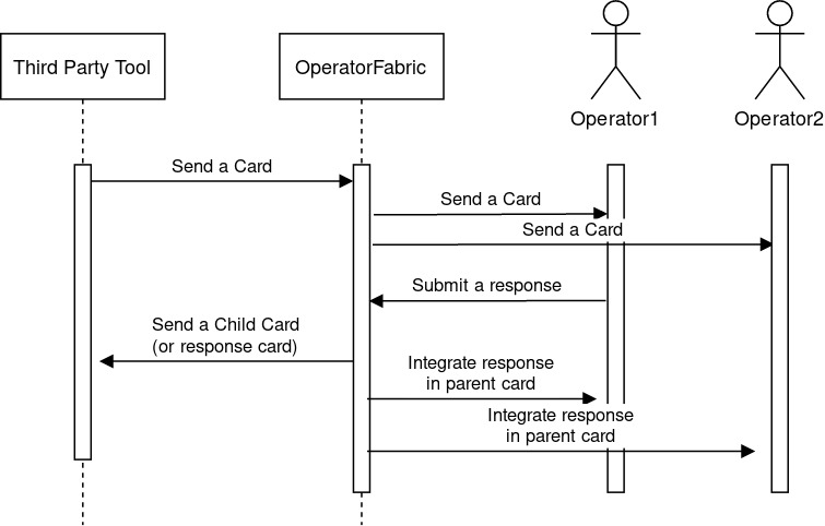
Notice that the response will be associated to the entity and not to the user, i.e the user responds on behalf of his entity. A user can respond more than one time to a card (a future evolution could add the possibility to limit to one response per entity).
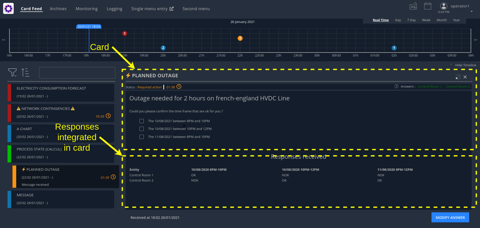
You can view a screenshot of an example of card with responses :
6.1. Steps needed to use a response card
6.1.1. Define a third party tool
The response card is to be received by a third party application for business processing. The third-party application will receive the card as an HTTP POST request. The card is in json format (the same format as when we send a card). The field data in the json contains the user response.
The url of the third party receiving the response card is to be set in the .yml of the publication service. It is also possible to configure whether the user token shall be propagated to the third party or not by setting the "propagateUserToken" boolean property. Here is an example with two third parties configured.
operatorfabric:
  cards-publication:
    external-recipients:
      recipients:
        - id: "third-party1"
          url: "http://thirdparty1/test1"
          propagateUserToken: true
        - id: "third-party2"
          url: "http://thirdparty2:8090/test2"
          propagateUserToken: false
The name to use for the third-party is the publisherId of the parent card.
|
For the url, do not use localhost if you run OperatorFabric in a docker, as the publication-service will not be able to join your third party. |
6.1.2. Configure the response in config.json
A card can have a response only if it’s in a process/state that is configured for. To do that you need to define the appropriate configuration in the config.json of the concerned process. Here is an example of configuration:
{
  "id": "defaultProcess",
  "name": "Test",
  "version": "1",
  "states": {
    "questionState": {
      "name": "question.title",
      "color": "#8bcdcd",
      "response": {
        "state": "responseState",
        "externalRecipients":["externalRecipient1", "externalRecipient2"],
        "showConfirmationPopup": false,
        "emittingEntityAllowedToRespond": true
      },
      "templateName": "question",
      "styles": [
        "style"
      ],
      "acknowledgmentAllowed": "Never",
      "showDetailCardHeader" : true
    },
    "responseState": {
      "name" : "response.title",
      "isOnlyAChildState" : true
    }
  }
}
We define here a state name "questionState" with a response field. Now, if we send a card with process "defaultProcess" and state "questionState", the user will have the possibility to respond if he has the required privileges.
-
The field "state" in the response field is used to define the state to use for the response (the child card).
-
The field "externalRecipients" define the recipients of the response card. These recipients are the ids of the objects referenced in the config file of cards-publication service, in "external-recipients" element. This field is optional.
-
The field "showConfirmationPopup" is used to display a confirmation popup before sending the response. The default value is false.
-
The field "emittingEntityAllowedToRespond" in the response field is used to allow the emitting entity to respond to a card. To be able to respond, however, the emitting entity has to be one of the recipients of the card. Default value is false.
-
The field "showDetailCardHeader" permits to display the card header or not. This header contains the list of entities that have already responded or not, and a countdown indicating the time remaining to respond, if necessary.
-
The field "isOnlyAChildState" indicates whether the state is only used for child cards or not. If yes, the state is displayed neither in the feed notification configuration screen nor in archives screen filters.
The state to be used for the response can also be set dynamically based on the contents of the card or the
response by returning it in the method registered by opfab.currentCard.registerFunctionToGetUserResponse (see below for details).
|
|
There is also the possibility to replace the "validate answer" and "modify answer" default button labels in the config.json of the process: "questionState": {
"validateAnswerButtonLabel": "Submit your answer",
"modifyAnswerButtonLabel": "Change your answer"
|
6.1.3. Design the question form in the template
For the user to response you need to define the response form in the template with standard HTML syntax
To enable OperatorFabric to send the response, you need to implement a javascript function in your template which returns an object containing the following fields :
-
valid (boolean) : true if the user input is valid
-
errorMsg (string) : message in case of invalid user input. If valid is true this field is not necessary.
-
responseCard:
-
data (any) : the user input to send in the data field of the child card.
-
state : name of the response state to use. This field is not mandatory, if it is not set the state defined in
config.jsonwill be used for the response. -
publisher (string) : the id of the Entity to be used as publisher of the response. This field is not mandatory, if it is not set the publisher will be the user entity, in case the user belongs to a single entity, or it will be choosen by the user between his available entities.
-
severity (string) : an optional field used to define the severity of the response card. The default value is "INFORMATION".
-
actions (string array) : an optional field used to define a set of predetermined actions that will be executed upon receiving the response card. The available actions include:
-
PROPAGATE_READ_ACK_TO_PARENT_CARD : when receiving the child card, the status of the parent card should be considered as 'unread' and 'not acknowledged' until the user reads or acknowledge it again.
-
-
This method is to be registered via opfab.currentCard.registerFunctionToGetUserResponse, the method will be called by OperatorFabric when the user clicks on the button to send the response.
In the example below, the getUserResponse creates a responseCard object by retrieving the user’s inputs from the HTML.
In addition, if the user choses the refusal option, it overrides the response state defined in the config.json with another
state. It is also possible to dynamically set the severity of the response with a logic from the template. Here the severity of the response depends on the number of choices selected by the user.
    function fetchResponseCardData() {

        const answer = document.getElementById('opfab-toggle').checked;
        let reason = '';
        // answer = true means refusal in the toggle
        if (answer) {
            reason = document.querySelector('#answer-select').value;
        }

        const comment = document.getElementById('comment').value;

        const result = {
            valid: true,
            responseCard:{
                data: {
                propositionRefused: answer,
                reason: reason,
                comment: comment
                }
            }
        };

        // If the user chooses to answer no, we decide to move the process to a specific state, for example to ask a follow-up question (what's their preferred option).
        if (answer){
            result.responseCard['state'] = 'refuseResponseState';
            result.responseCard['severity'] = "ALARM"
        }  else {
            result.responseCard['severity'] = "COMPLIANT"
        }
        return result
    }
opfab.currentCard.registerFunctionToGetUserResponse(fetchResponseCardData);|
The method registered via |
6.1.4. Define permissions
To respond to a card a user must have the right privileges, it is done using "perimeters". The user must be in a group that is attached to a perimeter with a right "ReceiveAndWrite" for the concerned process/state, the state being the response state defined in the config.json.
Here is an example of definition of a perimeter :
{
  "id" : "perimeterQuestion",
  "process" : "defaultProcess",
  "stateRights" : [
    {
      "state" : "responseState",
      "right" : "ReceiveAndWrite"
    }
  ]
}
To configure it in OperatorFabric , you need to make a POST of this json file to the end point /users/perimeters.
To add it to a group name for example "mygroup", you need to make a PATCH request to endpoint 'users/groups/mygroup/perimeters' with payload ["perimeterQuestion"]
6.2. Send a question card
The question card is like a usual card except that you have the field "entitiesAllowedToRespond" to set with the entities allowed to respond to the card. If the user is not in the entity, he will not be able to respond.
...
"process"  :"defaultProcess",
"processInstanceId" : "process4",
"state": "questionState",
"entitiesAllowedToRespond": ["ENTITY1_FR","ENTITY2_FR"],
"severity" : "ACTION",
...
| By default, OperatorFabric considers that if the parent card (question card) is modified, then the child cards are deleted. If you want to keep the child cards when the parent card is changed, then you must add in the parent card the field "actions" as a string array containing the "KEEP_CHILD_CARDS" action. |
The header in the card details will list the entities from which a response is expected, color-coding them depending on whether they’ve already responded (green) or not (orange).
You can also set the property entitiesRequiredToRespond to differentiate between entities can respond
(entitiesAllowedToRespond) and those who must respond (entitiesRequiredToRespond).
|
...
"process"  :"defaultProcess",
"processInstanceId" : "process4",
"state": "questionState",
"entitiesAllowedToRespond": ["ENTITY1_FR","ENTITY2_FR","ENTITY3_FR"],
"entitiesRequiredToRespond": ["ENTITY1_FR","ENTITY2_FR"],
"severity" : "ACTION",
...
6.2.1. Difference between entitiesAllowedToRespond and entitiesRequiredToRespond
The properties entitiesAllowedToRespond and entitiesRequiredToRespond serve different purposes:
-
entitiesAllowedToResponddefines all entities that are authorized to respond to the card. -
entitiesRequiredToResponddefines all entities from which a response is explicitly expected.
From a user interface perspective, this distinction impacts how information is displayed in the card detail header:
-
If only
entitiesAllowedToRespondis defined, all these entities are displayed in the header and are considered as expected to respond. -
If
entitiesRequiredToRespondis defined and not empty, only these entities are displayed in the header, even if additional entities are allowed to respond.
This behavior allows focusing the user’s attention on the entities whose response is truly required, while still allowing other entities to contribute if needed.
The authorization to respond is determined by the union of entitiesAllowedToRespond and entitiesRequiredToRespond. An entity does not need to be present in both lists to be able to respond.
|
6.3. Integrate child cards
For each user response, a child card containing the response is emitted and stored in OperatorFabric like a normal card. It is not directly visible on the ui but this child card can be integrated in real time to the parent card of all the users watching the card. To do that, you need some code in the template to process child data:
You shall give a reference to a method for processing the child cards via opfab.currentCard.listenToChildCards .
The defined method shall have an array of child cards as a parameter and will be called by OperatorFabric when loading the card and every time the list of child cards changes.
opfab.currentCard.listenToChildCards( (childCards) => { // process child cards });6.3.1. Entity name
If you want to show the name of an entity that send the response, you need to get the id of the entity via the publisher field of the child card and then you can get the name of the entity by calling opfab.users.entities.getEntityName(entityId)
6.3.2. Example
You can find an example in the file tests/resources/bundles/defaultProcess_V1/template/question.handlebars.
6.4. Lock mechanism
When a user has never answered to a response card, the button will be marked as "VALIDATE ANSWER" and the card will be unlocked. When the user responds for the first time (and the response succeeds), the button will then be marked as "MODIFY ANSWER" and the information that the card has been locked can be sent to the third template (see opfab.currentCard.listenToResponseLock in frontend API).
Once a user has responded to a response card, its entity status will be considered as "already answered" for this card. Then all the users having the same entity will be in this status for this card.
From there, as soon as they will open this card the button will be marked as "MODIFY ANSWER" and this information (i.e. that this entity has already responded) is accessible to the card template (see opfab.currentCard.isResponseLocked in frontend API).
The user can then click on "MODIFY ANSWER" and the button will come back to its initial state ("VALIDATE ANSWER") and the information that the user wants to modify its initial answer can be sent to the card template (see opfab.currentCard.listenToResponseUnlock in frontend API).
7. User cards
Using the Create card menu, the user can send cards to entities. This feature needs to be configured.
7.1. Configure the bundle
A card is related to a process and a state, if you want users to be able to emit a card for a specific process and state, you need to define it in the bundle for this process.
For example :
"id": "conferenceAndITIncidentExample",
"name": "conferenceAndITIncidentExample.label",
"version": "1",
"states": {
  "messageState": {
    "name": "message.title",
    "userCard" : {
      "template" : "usercard_message",
      "severityVisible" : true,
      "startDateVisible" : true,
      "endDateVisible" : true,
      "expirationDateVisible" : false,
      "lttdVisible" : false,
    },
    "templateName": "message",
    "styles": [],
    "acknowledgmentAllowed": "Always"
  }
}
In this example, the field userCard states that we have a template called usercard_message that defines how
the specific business input fields for this user card will be displayed in the card sending form that will be
presented to the user (through the Create Card menu).
This template works the same as templates for card presentation. Here is an example :
<div class="opfab-textarea">
    <label> MESSAGE </label>
    <textarea id="message" name="message" placeholder="Write something.."
        style="width:100%"> {{card.data.message}} </textarea>
</div>


<script>
    opfab.currentCard.registerFunctionToGetSpecificCardInformation( () => {
        const message = document.getElementById('message').value;
        const card = {
          summary : {key : "message.summary"},
          title : {key : "message.title"},
          data : {message: message}
        };
        if (message.length<1) return { valid:false , errorMsg:'You must provide a message'}
        return {
            valid: true,
            card: card
        };

    }
</script>
The first part defines the HTML for the business-specific input fields. It should only include the form
fields specific to your process, because the generic fields (like startDate , endDate , severity … ) are presented
by default. It is possible to hide certain generic fields, by setting their visibility to false in the config.json
(for example field severityVisible).
Please note that you should use an OpFab css class so the "business-specific" part of the form has the same look and feel (See OperatorFabric Style for more information)
| Be aware that as we have a preview of the card, the application loads the html related to the usercard (build with the usercard template) and the html related to the card in preview (build with the card template) into the browser at the same time. This implies that you MUST NOT name the elements with the same names in both templates. This rule applies to HTML elements identifiers(id), global JavaScript variables and JavaScript function names. |
Once the card has been sent, users with the appropriate rights can edit it. If they choose to do so, they’re presented
with the same input form as for the card creation, but the fields are pre-filled with the current data of the card.
This way, they can only change what they need without having to re-create the card from scratch.
That’s what the reference to {{card.data.message}} is for. It means that this text-area input field should be filled
with the value of the field message from the card’s data.
The second part is a javascript method you need to implement to allow OperatorFabric to get your specific data .
To have a better understanding of this feature, we encourage you to have a look at the examples in the OperatorFabric core repository under (tests/resources/bundles/conferenceAndITIncidentExample).
7.2. Method registerFunctionToGetSpecificCardInformation
The following card fields can be set via the object card in the object returned by the method register via
registerFunctionToGetSpecificCardInformation:
-
title
-
summary
-
startDate (epoch date in ms)
-
endDate (epoch date in ms)
-
expirationDate (epoch date in ms)
-
lttd (epoch date in ms)
-
secondsBeforeTimeSpanForReminder
-
severity (in case it is not visible from the user , when
severityVisibleset to false inconfig.json) -
data
-
entityRecipients
-
entitiesAllowedToEdit
-
entitiesAllowedToRespond
-
entitiesRequiredToRespond
-
groupRecipients
-
externalRecipients (used to send cards to third party , see Define a third party tool for more information).
-
rRule (used to define a card with recurrence, see Using rRule field for more information).
-
tags (list of strings)
-
wktGeometry (string)
-
wktProjection (string)
-
actions (list of card actions)
If you send a card to an ExternalRecipient, when the user delete it, the external recipient will receive the information via an HTTP DELETE request with the id of the deleted card at the end of the request (example : myexternal_app/myendpoint/ID_CARD).
If you want the card to be visible in the calendar feature, you need to set 'timeSpans' field (as array of TimeSpans objects) in the object returned by the method. You can find an example in the file: tests/resources/bundles/taskExample/template/usercard_task.handlebars.
If not using 'timeSpans' it’s possible to set the 'viewCardInCalendar' field to true, the card will be visible using card’s startDate and endDate as default timeSpan.
If the form is not filled correctly by the user, you can provide an error message (see example above). Again, have a look to the examples provided.
|
The method registered via |
7.3. Define permissions
To send a user card, the user must be member of a group that has a perimeter defining the right ReceiveAndWrite
or Write for the chosen process and state. For example:
{
  "id" : "perimeterUserCard",
  "process" : "conferenceAndITIncidentExample",
  "stateRights" : [
    {
      "state" : "messageState",
      "right" : "ReceiveAndWrite"
    }
  ]
}
Using the ReceiveAndWrite right instead of the Write right allows the user to receive the card they sent and
edit or delete it.
|
7.4. Restrict the list of possible emitter entities
When sending a user card, if the user is member of multiple entities, it is possible to choose the emitter entity from all the available user entities. To limit the list of available emitter entities, it is possible to configure the property publisherList in userCard state definition with the list of allowed publisher entities.
For example :
"processState": {
      "name": "Process example ",
      "description": "Process state",
      "userCard" : {
        "template" : "usercard_process",
        "expirationDateVisible" : true,
        "publisherList": [{"id":"ENTITY_FR", "levels":[1]},{"id":"IT_SUPERVISOR_ENTITY"}]
      }
In this example the list of available publisher entities will contain all the first level children of "ENTITY_FR" (level 1) and "IT_SUPERVISOR_ENTITY".
7.5. Set the list of recipients via the template
To do that, you have to provide the list of recipients when returning the card object in the field entityRecipients.
Example:
    opfab.currentUserCard.registerFunctionToGetSpecificCardInformation( () => {
        const message = document.getElementById('message').value;
        const card = {
          summary : {key : "message.summary"},
          title : {key : "message.title"},
          entityRecipients: ["ENTITY_FR","IT_SUPERVISOR_ENTITY"],
          data : {message: message}
        };
        if (message.length<1) return { valid:false , errorMsg:'You must provide a message'}
        return {
            valid: true,
            card: card
        }
  });
When recipient dropdown is not visible to the user (attribute recipientVisible set to false in state definition in config.json) the final recipients list will be the one defined in the template, otherwise it will be the union of user selection and template entityRecipients definition.
7.6. Card editing
Once a user card has been sent it can be edited by a user member of the publisher entity who has write access for the process/state of the card. It is possible to allow other entities to edit the card by specifying the 'entitiesAllowedToEdit' card field. It is possible to hide card edit button on UI by setting 'editCardEnabledOnUserInterface' to false in card’s process/state definition.
7.7. Card copy
A user can copy a card and send it if he has write access for the process/state of the card. Before sending the card, the user can modify it if he wants. It is possible to hide card copy button on UI by setting 'copyCardEnabledOnUserInterface' to false in card’s process/state definition.
7.8. Card delete
Once a user card has been sent it can be deleted by a user member of the publisher entity who has write access for the process/state of the card. It is possible to hide card delete button on UI by setting 'deleteCardEnabledOnUserInterface' to false in card’s process/state definition.
7.9. Send response automatically (experimental feature)
It is possible to configure a template to automatically send a response when sending a user card expecting an answers from one of the entities of the emitting user. The response card will be sent only if the user is enabled to respond to the card.
To enable the automated response the template should add a childCard field to the object returned by
getSpecificCardInformation method. For example:
 <script>
     opfab.currentUserCard.registerFunctionToGetSpecificCardInformation( () =>  {
        const card = {...}

        childCard : {
          summary : {key : "example.summary"},
          title : {key : "example.title"},
          state : "mystateForResponse"
          data : {
                  // specific child  card date
                  }
          };
        ...
        return {
            valid: true,
            card: card,
            childCard: childCard
        };

    });
  </script>
The card preview will display the card detail with the automated response as it will be displayed in Feed page.
When editing a user card, the template can get the response sent by current user by calling the opfab.currentUserCard.getUserEntityChildCard function.
By default, the publisher of the childCard is the publisher of the parent card. In the template, it is possible to set another value for the publisher of the childCard, provided that the user is a member of the entity publisher you want to set.
7.10. send a card on behalf of the user
By default, when the user sends a card via the usercard interface, the card is sent on behalf of the entity of the user.
If you want to send a card on behalf of the user himself, you have to set the field publisherType to USER in the
usercard template, via the function registerFunctionToGetSpecificCardInformation. This way, the user will be set as
publisher instead of his entity.
In order to prevent the user from seeing the publisher entity multiselect, you should set the field publisherVisible to
false in the state configuration, in the file config.json of the corresponding bundle.
8. Built-in templates
Instead of coding your own templates for cards or user cards, you can use opfab built-in templates if it suits your needs.
8.1. Message
8.1.1. Card template
If you want to show only a simple message, you can use the message built-in template, to do that just put in your handlebar file :
<opfab-message-card> </opfab-message-card>The built-in template supposes the message is stored in the card in field data.message.
You can change the text header by providing the message-header attribute:
<opfab-message-card message-header="a new header"> </opfab-message-card>8.1.2. User card template
If you want to create a user card for a simple message, just add in your handlebar file :
<opfab-message-usercard> </opfab-message-usercard>The message will be stored in the field data.message of the card
By using attributes you can set some parameters regarding recipients, see common attributes for user cards
8.2. Question
8.2.1. Card template
If you want to show a question and see user responses, you can use the question built-in template, to do that just put in your handlebar file:
<opfab-question-card keepResponseHistoryInCard="false"> </opfab-question-card>The built-in template supposes the question is stored in the card in the field data.question.
To keep response history in card data, set the keepResponseHistoryInCard attribute to true. In the card details, you will find all response history along with their corresponding response dates.
8.2.2. User card template
If you want to create a user card for a simple question, just add in your handlebar file :
<opfab-question-usercard> </opfab-question-usercard>The question will be stored in the field data.question of the card
By using attributes you can set some parameters regarding recipients, see common attributes for user cards
8.3. Message Or Question List
8.3.1. Card template
If you want to show a message or a question and the answers, you can use the message or question list built-in template, to do that just put in your handlebar file:
<opfab-message-or-question-list-card> </opfab-message-or-question-list-card>The built-in template supposes the message or question is stored in the card in the field data.message.
8.3.2. User card template
If you want to create a user card where you can select a list of messages or questions linked to a json file, just add in your handlebar file :
<opfab-message-or-question-list-usercard businessData="businessDataFileName"> </opfab-message-or-question-list-usercard>The message will be stored in the field data.message of the card
You need to set the json file name with the businessData attribute
If you want to use the template as is, the json file must follow this structure :
`{ "possibleRecipients": [ {"id": "ENTITY1_FR"}, {"id": "ENTITY2_FR"} ],
"messagesList": [{
    "id": "Warning",
    "title": "Warning about the state of the grid",
    "summary": "Warning about the state of the grid : a problem has been detected",
    "message": "A problem has been detected, please put maintenance work on hold and be on stand by",
    "question": false,
    "severity": "ALARM",
    "publishers":  [
        "ENTITY1_FR",
        "ENTITY2_FR",
        "ENTITY3_FR"
    ]
    "recipients" : [
        "ENTITY1_FR",
        "ENTITY2_FR"
    ]
},
{
    "id": "Confirmation",
    "title": "Confirmation the issues have been fixed",
    "message": "Please confirm the issues in your area have been fixed",
    "question": true,
    "severity": "ACTION",
    "recipients" : [
        "ENTITY1_FR"
    ]
}]
}`
The possibleRecipients field is optional. If specified and not empty, the list of possible recipients will be restricted to the specified list. If not specified or empty, the possible recipients list will not be restricted.
The severity field is optional. If not specified, the card will take a default severity value depending on 'question'
field value : "ACTION" if question is true, "INFORMATION" if question is false.
The publishers field is optional. It is used to restrict the possible publishers of the message. If specified, the
message option is available only for the specified entities. If not specified or empty, there are no restrictions.
The summary field is optional. If specified, considering 'xxx' is the value of the field, so the summary you will see
in the feed will be 'Message received : xxx'. If left empty the summary input field in user card will be displayed with no initial value and the summary in the feed will be 'Message received'. If not specified, the summary input field will not be displayed in user card form and the summary will be 'Message received'.
8.4. Task
8.4.1. Card template
If you want to set a reminder for a single or recurring future event, you can use the task built-in template, to do that just put in your handlebar file:
<opfab-task-card></opfab-task-card>8.4.2. User card template
If you want to create a user card for a task, just add in your handlebar file :
<opfab-task-usercard></opfab-task-usercard>The description of the task will be stored in the fields :
-
data.taskTitle -
data.richTaskDescription -
data.minutesForReminder -
data.durationInMinutes
of the card.
By using attributes you can set some parameters regarding recipients, see common attributes for user cards
8.5. Common attributes for user cards built-in templates
For each user card templates, you can set :
-
The initial severity
-
The entity recipient list
-
The initial selected recipients
-
The entity recipient for information list
-
The initial selected recipients for information
-
The external recipients
For example :
<opfab-message-usercard
    initialSeverity="INFORMATION"
    entityRecipientList='[{"id": "ENTITY_FR", "levels": [0, 1]}, {"id": "ENTITY_IT"},{"id": "IT_SUPERVISOR_ENTITY"}]'
    initialSelectedRecipients='["ENTITY1_FR", "ENTITY2_FR", "ENTITY3_FR"]'
    entityRecipientForInformationList='[{"id": "ENTITY_FR", "levels": [0, 1]},{"id": "IT_SUPERVISOR_ENTITY"}]'
    initialSelectedRecipientsForInformation='["ENTITY4_FR"]'
    externalRecipients='["externalRecipient1", "externalRecipient2"]'>
</opfab-message-usercard>
9. Business Data
Using the API, it is possible to store business data and then call it from the templates. This storage system is intended for light documents and should not be treated as a database.
9.1. Pushing data
It is expected for the data being pushed to be compliant with the json format. The different methods are detailed in the (API documentation). The default limit of file size accepted is 100 MB, it can be updated in the nginx configuation.
9.2. Calling a resource
Once a resource has been stored, it is possible to call it from the template of a card. See in this template (usercard_incidentInProgress.handlebars) how the resource services is called with the method opfab.businessconfig.businessData.get()
This prevents writing directly in the template’s code long lists and allows easy data duplication between templates.
10. Frontend API
The frontend API is intended to provide a way for template to communicate with the core opfab code. It’s divided as follows :
-
Users API : API to get information about users and entities
-
BusinessConfig API : API to get business configuration information
-
Handlebars API : API to register custom helpers
-
Navigate API : API to ask opfab to navigate to a specific view
-
CurrentCard API : API to get information regarding the current card
-
CurrentUserCard API : API to get information regarding the current user card (card in creation or edition)
-
AlertMessage API : API to send alert messages
-
UI API : API to access elements from the interface
-
Cards API : API to get or send cards
-
Utils API : utilities functions
-
LightCards API : API to access light cards properties
10.1. Users API
10.1.1. Entities
Entity object contains the following fields :
-
'id' : id of the entity
-
'name' : name of the entity
-
'description' : description of the entity
-
'parents' : list of parent entities
-
'labels' : list of labels associated to the entity
10.1.1.1. Function getEntityName
Obtain the name of an entity :
const myEntityName = opfab.users.entities.getEntityName('myEntityId');10.2. BusinessConfig API
10.2.1. BusinessData
10.2.1.1. Function get
It is possible to get business data json file content:
const businessData = opfab.businessconfig.businessData.get('businessDataFileName');The function take as input the name of the business data file (without the extension) and returns the content of the json file as a javascript object.
10.2.1.2. Function registerFunctionToListenToBusinessDataUpdates
It is possible to register at startup the function to be used to listen to business data updates:
opfab.businessconfig.businessData.registerFunctionToListenToBusinessDataUpdates( () => {
// do some stuff
});
The function given as parameter will be called by opfab when business data need to be refreshed (i.e a business data file has changed on server side , it is not possible to specify which file has changed).
|
It is not yet possible to unregister the function once registered so you should avoid registering function multiple times (it must be avoided in templates for example). |
10.2.2. Function registerCustomScreen
It is possible to register at startup a custom screen definition:
opfab.businessconfig.registerCustomScreen(screenDefinition);See chapter custom screens for more details on the screen definition structure.
10.2.3. Function registerFunctionToGetTags
It is possible to register at startup the function to be used to retrieve the list of tags:
opfab.businessconfig.registerFunctionToGetTags(function);The registered function must take as input parameter the screen name. The possible values for screen name are : 'archive', 'logging', 'processMonitoring'.
An example of usage can be found in the file config/docker/externalJs/loadTags.js.
If no custom function is registered or if the registered function returns undefined, then Opfab will take the tags values configured in web-ui.json.
10.3. Handlebars API
10.3.1. Function registerCustomHelpers
It is possible to register at startup the function to be used to retrieve a list of custom handlebars helpers:
opfab.handlebars.registerCustomHelpers([function]);The function takes as argument a list of functions that will be registered as handlebars helpers, each helper will be registered with the same name of the helper function.
To avoid conflict with existing helpers, it is recommended to prefix your helper (For example : myapp_xxx)
An example of usage can be found in the file config/docker/externalJs/handlebarsExample.js.
10.4. Navigate API
10.4.1. Function redirectToBusinessMenu
It’s possible to redirect the user from a card to a business application declared in the ui menu configuration.
This can be done by calling the following function from the template :
opfab.navigate.redirectToBusinessMenu(idMenu);-
idMenu is the id of the menu entry defined in the ui menu configuration
It is also possible to append a url extension (sub paths and/or parameters) to the url that will be called:
opfab.navigate.redirectToBusinessMenu('myMenu','/extension?param1=aParam¶m2=anotherParam');This can be useful to pass context from the card to the business application.
10.5. CurrentCard API
10.5.1. Function displayLoadingSpinner
Once the card is loaded, there may be some processing that is time-consuming. In this case, it is possible to show a spinner using the method displayLoadingSpinner and hideLoadingSpinner in the card template.
        opfab.currentCard.displayLoadingSpinner();
        // Time consumming code
        ....
        opfab.currentCard.hideLoadingSpinner();
10.5.2. Function hideLoadingSpinner
Hide loading spinner previously open with displayLoadingSpinner()
opfab.currentCard.hideLoadingSpinner()10.5.3. Function getChildCards
Returns an array of the child cards. The structure of a child card is the same as the structure of a classic card.
const childCards = opfab.currentCard.getChildCards();10.5.4. Function getCard()
You can access the current selected card as a js object using the getCard() method.
const currentCard = opfab.currentCard.getCard();10.5.5. Function isUserAllowedToEdit
To check if the current user has the permission to edit the current card, you can call the isUserAllowedToEdit() method.
const editAllowed = opfab.currentCard.isUserAllowedToEdit()10.5.6. Function editCard
It is possible to open current card edition modal, if the current user has the permission, by calling the editCard() method.
opfab.currentCard.editCard()10.5.7. Function getDisplayContext
To adapt the template content to the display context, it is possible to get from OperatorFabric the page context where the template will be rendered by calling the javascript function getDisplayContext(). The function returns a string with one of the following values :
-
'realtime' : realtime page context (feed, monitoring)
-
'archive' : archive page context
-
'preview': preview context (user card)
const displayContext = opfab.currentCard.getDisplayContext();10.5.8. Function getEntitiesAllowedToRespond
If inside your template, you want to get the ids of the entities allowed to send a response, you can call the method getEntitiesAllowedToRespond. This method returns an array containing the ids.
const entities = opfab.currentCard.getEntitiesAllowedToRespond();10.5.9. Function getEntitiesUsableForUserResponse
If inside your template, you want to get the ids of the entities the user can answer on behalf of, you can call the method getEntitiesUsableForUserResponse. This method will return an array containing the entities' ids.
const entities = opfab.currentCard.getEntitiesUsableForUserResponse()10.5.10. Function isResponseLocked
To know if the template is locked (i.e. user can not respond unless he unlocks the card)
const isResponseLocked = opfab.currentCard.isResponseLocked()10.5.11. Function isUserAllowedToRespond
The template can know if the current user has the permission to send a response to the current card by calling the isUserAllowedToRespond() function. An example of usage can be found in the file tests/resources/bundles/conferenceAndITIncidentExample/template/incidentInProgress.handlebars.
const isUserAllowed = opfab.currentCard.isUserAllowedToRespond();10.5.12. Function isUserMemberOfAnEntityRequiredToRespond
The template can know if the current user is a member of an Entity required to respond by calling the isUserMemberOfAnEntityRequiredToRespond function. An example of usage can be found in the file tests/resources/bundles/defaultProcess_V1/template/question.handlebars.
const isUserRequired = opfab.currentCard.isUserMemberOfAnEntityRequiredToRespond()10.5.13. Function listenToDestroy
Register a function to listen for template destruction (i.e., when a card is removed from display). This is especially useful if you need to remove JavaScript event listeners.
opfab.currentCard.listenToDestroy(() => {// Do some stuff});Only one listener can be registered at a time. If you register another listener, the previous listener will not receive events.
10.5.14. Function listenToResponseFromChildcardsSending
Register a function that will be called after a child card (or response card) has been sent. The function will receive as parameter an object with the following fields: - error: boolean indicating if an error occurred during the sending of the child card - message: in case of error, the error message - publisher: the entity on behalf of which the child card has been sent
    opfab.currentCard.listenToResponseFromChildcardsSending((response) => {
         console.log("Response from child card sending: ", response);
    });
10.5.15. Function listenToResponseLock
Register a function to be informed when the template is locked (i.e. user has responded to the current card)
opfab.currentCard.listenToResponseLock( () => {// do some stuff});10.5.16. Function listenToResponseUnlock
Register a function to be informed when template is unlocked (i.e. user has clicked the modify button to prepare a new response)
opfab.currentCard.listenToResponseUnlock( () => {// do some stuff}))10.5.17. Function listenToChildCards
Register a function to receive the child cards on card loading and when the childCards list changes
opfab.currentCard.listenToChildCards( (childCards) => { // process child cards });10.5.18. Function listenToLttdExpired
If the card has a last time to decide (lttd) configured, when the time is expired this information can be received by the template by registering a listener.
opfab.currentCard.listenToLttdExpired( () => { // do some stuff });10.5.19. Function listenToStyleChange
Card template can be informed when switching day/night mode by registering a listener as follows :
opfab.currentCard.listenToStyleChange( () => { // do some stuff });It can be used by a template to refresh styles and reload embedded charts.
10.5.20. Function listenToScreenSize
To adapt the template content on screen size, it is possible to receive from OperatorFabric information on the size of the window where the template will be rendered. To receive screen size information, you need to implement a listener function which will receive as input a string parameter with one of the following values :
-
'md' : medium size window
-
'lg' : large size window
        opfab.currentCard.listenToScreenSize( (screenSize) => {
            if (screenSize == 'lg') // do some stuff
            else // do some other stuff
        })
10.5.21. Function listenToTemplateRenderingComplete
It is possible to be informed when opfab has finished all tasks regarding rendering template by registering a listener function .The function will be called after the call of the other listener (applyChildCard, lockAnswer, lttdExpired and screenSize)
It can be used by a template to launch some processing when loading is complete
opfab.currentCard.listenToTemplateRenderingComplete(() => {// do some stuff})10.5.22. Function registerFunctionToGetUserResponse
Register the template function to call to get user response. This function will be called by opfab when the user clicks on the "send response" button. More explanation can be found in the response card chapter.
For example :
        opfab.currentCard.registerFunctionToGetUserResponse ( () =>
          {
                const question = document.getElementById('question').value;

                if (question.length <1) return {
                    valid: false,
                    errorMsg : "You must provide a question"
                }

                const card = {
                    summary: { key: "question.summary" },
                    title: { key: "question.title" },
                    severity: "ACTION",
                    data: {
                        question: question,
                    }
                };
                return {
                    valid: true,
                    responseCard: card,
                    viewCardInCalendar: false
                };

            })
10.6. CurrentUserCard API
10.6.1. Function getEditionMode
The template can know if the user is creating a new card or editing an existing card by calling the opfab.currentUserCard.getEditionMode() function. The function will return one of the following values:
-
'CREATE'
-
'EDITION'
-
'COPY'
const mode = opfab.currentUserCard.getEditionMode();10.6.2. Function getEndDate
The template can know the current endDate of the card in creation or edition by calling the opfab.currentUserCard.getEndDate() function. The function will return a number corresponding to the endDate as epoch date value.
const endDate = opfab.currentUserCard.getEndDate();10.6.3. Function getExpirationDate
The template can know the current expirationDate of the card in creation or edition by calling the opfab.currentUserCard.getExpirationDate() function. The function will return a number corresponding to the expirationDate as epoch date value.
const expirationDate = opfab.currentUserCard.getExpirationDate();10.6.4. Function getLttd
The template can know the current lttd of the card in creation or edition by calling the opfab.currentUserCard.getLttd() function. The function will return a number corresponding to the lttd as epoch date value.
const lttd = opfab.currentUserCard.getLttd();10.6.5. Function getProcessId
The template can know the process id of the card by calling the opfab.currentUserCard.getProcessId() function. The function will return a string corresponding to the process id.
const id = opfab.currentUserCard.getProcessId();10.6.6. Function getSelectedEntityRecipients
The template can know the list of entities selected by the user as recipients of the card by calling the opfab.currentUserCard.getSelectedEntityRecipients() function. The function will return an array of entity ids.
const recipients = opfab.currentUserCard.getSelectedEntityRecipients();10.6.7. Function getSelectedEntityForInformationRecipients
The template can know the list of entities selected by the users as recipients of the card by calling the opfab.currentUserCard.getSelectedEntityForInformationRecipients() function. The function will return an array of entity ids.
const recipients = opfab.currentUserCard.getSelectedEntityForInformationRecipients();10.6.8. Function getStartDate
The template can know the current startDate of the card in creation or edition by calling the opfab.currentUserCard.getStartDate() function. The function will return a number corresponding to the startDate as epoch date value.
const startDate = opfab.currentUserCard.getStartDate();10.6.9. Function getState
The template can know the state of the card by calling the opfab.currentUserCard.getState() function. The function will return a string corresponding to the state.
const state = opfab.currentUserCard.getState();10.6.10. Function getUserEntityChildCard
When editing a user card, the template can get the response sent by the entity of the current user by calling the opfab.currentUserCard.getUserEntityChildCard() function. The function will return the response child card sent by current user entity or null if there is no response.
const card = opfab.currentUserCard.getUserEntityChildCard();| The method returns only one child card and is therefore not compatible with the fact that the user is in more than one activity area authorized to send the card. In this case, if there is more than one child card, only one will be returned. |
10.6.11. Function listenToDestroy
Register a function to listen for template destruction (i.e., when a usercard is removed from display). This is especially useful if you need to remove JavaScript event listeners.
opfab.currentUserCard.listenToDestroy(() => {// Do some stuff});Only one listener can be registered at a time. If you register another listener, the previous listener will not receive events.
10.6.12. Function listenToEntityUsedForSendingCard
The template can receive the emitter entity of the card by registering a listener function. The function will be called by OperatorFabric after loading the template and every time the card emitter changes (if the user can choose from multiple entities).
opfab.currentUserCard.listenToEntityUsedForSendingCard((entityId) => {// do some stuff with the entity id})10.6.13. Function registerFunctionToBeCalledBeforeCardSending
Before sending the card and after the preview, you can define a method to be called. This method is blocking (i.e., it is an async method awaited by the opfab code).
The card to be sent is provided as a parameter.
If the method throws an error, the error message will be shown to the user on the top screen banner and the card will not be sent.
For example :
    opfab.currentUserCard.registerFunctionToBeCalledBeforeCardSending( async(cardToBeSent) => {

      // do some stuff

      // throws error if needed

    })
10.6.14. Function registerFunctionToGetSpecificCardInformation
Register the template function to call to get user card specific information. This function will be called by opfab when user clicks on the "preview" button. More explanation can be found in the user card chapter.
For example:
        opfab.currentCard.registerFunctionToGetSpecificCardInformation( () => {
        const message = document.getElementById('message').value;
        const card = {
          summary : {key : "message.summary"},
          title : {key : "message.title"},
          data : {message: message}
        };
        if (message.length<1) return { valid:false , errorMsg:'You must provide a message'}
        return {
            valid: true,
            card: card
        };

    }
10.6.15. Function setDropdownEntityRecipientList
When sending a user card, by default, it is possible to choose the recipients from all the available entities. To limit the list of available recipients, it is possible to configure the list of possible recipients via javascript in the user template.
For example :
    opfab.currentUserCard.setDropdownEntityRecipientList([
            {"id": "ENTITY_FR", "levels": [0,1]},
            {"id": "IT_SUPERVISOR_ENTITY"}
        ]);
In this example, the list of available recipients will contain: "ENTITY_FR" (level 0), all the first level children of "ENTITY_FR" (level 1) and "IT_SUPERVISOR_ENTITY".
10.6.16. Function setDropdownEntityRecipientForInformationList
When sending a user card, by default, it is possible to choose the recipients for information from all the available entities. To limit the list of available recipients, it is possible to configure the list of possible recipients via javascript in the user template.
For example :
    opfab.currentUserCard.setDropdownEntityRecipientForInformationList([
            {"id": "ENTITY_FR", "levels": [0,1]},
            {"id": "IT_SUPERVISOR_ENTITY"}
        ]);
In this example the list of available recipients for information will contain: "ENTITY_FR" (level 0), all the first level children of "ENTITY_FR" (level 1) and "IT_SUPERVISOR_ENTITY".
10.6.17. Function setInitialEndDate
From the template it is possible to set the initial value for endDate by calling opfab.currentUserCard.setInitialEndDate(endDate) . The endDate is a number representing an epoch date value.
        const endDate = new Date().valueOf() + 10000;
        opfab.currentUserCard.setInitialEndDate(endDate);
10.6.18. Function setInitialExpirationDate
From the template it is possible to set the initial value for expirationDate by calling opfab.currentUserCard.setInitialExpirationDate(expirationDate) . The expirationDate is a number representing an epoch date value.
        const expirationDate = new Date().valueOf() + 10000;
        opfab.currentUserCard.setInitialExpirationDate(expirationDate);
10.6.19. Function setInitialLttd
From the template it is possible to set the initial value for lttd by calling opfab.currentUserCard.setInitialLttd(lttd) . The lttd is a number representing an epoch date value.
        const lttd = new Date().valueOf() + 10000;
        opfab.currentUserCard.setInitialLttd(lttd);
10.6.20. Function setInitialSelectedRecipients
It is possible to configure the list of initially selected recipients via javascript in the user template by calling the setInitialSelectedRecipients method. The method takes as input the list of Entity ids to be preselected. The method will work only at template loading time, cannot be used to modify the selected recipients after the template is loaded or in card edition mode.
For example :
    opfab.currentUserCard.setInitialSelectedRecipients([
            "ENTITY_FR",
            "IT_SUPERVISOR_ENTITY"
        ]);
In this example the dropdown list of available recipients will have "ENTITY_FR" and "IT_SUPERVISOR_ENTITY" preselected. The user can anyway change the selected recipients.
10.6.21. Function setInitialSelectedRecipientsForInformation
It is possible to configure the list of initially selected recipients for information via javascript in the user template by calling the setInitialSelectedRecipientsForInformation method. The method takes as input the list of Entity ids to be preselected. The method will work only at template loading time, cannot be used to modify the selected recipients after the template is loaded or in card edition mode.
For example :
    opfab.currentUserCard.setInitialSelectedRecipientsForInformation([
            "ENTITY_FR",
            "IT_SUPERVISOR_ENTITY"
        ]);
In this example the dropdown list of available recipients will have "ENTITY_FR" and "IT_SUPERVISOR_ENTITY" preselected. The user can anyway change the selected recipients for information.
10.6.22. Function setSelectedRecipients
It is possible to configure the list of selected recipients via javascript in the user template by calling the setInitialSelectedRecipients method. The method takes as input the list of Entity ids to be preselected. This method can be called at any time and also in edition mode.
For example :
    opfab.currentUserCard.setSelectedRecipients([
            "ENTITY_FR",
            "IT_SUPERVISOR_ENTITY"
        ]);
In this example the dropdown list of available recipients will have "ENTITY_FR" and "IT_SUPERVISOR_ENTITY" preselected. The user can anyway change the selected recipients.
10.6.23. Function setSelectedRecipientsForInformation
It is possible to configure the list of selected recipients for information via javascript in the user template by calling the setSelectedRecipientsForInformation method. The method takes as input the list of Entity ids to be selected. This method can be called at any time and also in edition mode.
For example :
    opfab.currentUserCard.setSelectedRecipientsForInformation([
            "ENTITY_FR",
            "IT_SUPERVISOR_ENTITY"
        ]);
In this example the dropdown list of available recipients will have "ENTITY_FR" and "IT_SUPERVISOR_ENTITY" preselected. The user can anyway change the selected recipients for information.
10.6.24. Function setInitialSeverity
From the template it is possible to set the initial value for card severity choice by calling the function setInitialSeverity(severity)
Allowed severity values are:
-
'ALARM'
-
'ACTION'
-
'INFORMATION'
-
'COMPLIANT'
opfab.currentUserCard.setInitialSeverity('ACTION');10.6.25. Function setInitialKeepChildCards
From the template it is possible to set the initial value to keep child cards or not by calling the function setInitialKeepChildCards(keepChildCards)
'keepChildCards' is expected to be a boolean.
opfab.currentUserCard.setInitialKeepChildCards(true);10.6.26. Function setInitialStartDate
From the template it is possible to set the initial values for startDate by calling opfab.currentUserCard.setInitialStartDate(startDate) . The startDate is a number representing an epoch date value.
        const startDate = new Date().valueOf();
        opfab.currentUserCard.setInitialStartDate(startDate);
10.7. Utils API
10.7.1. Function escapeHtml
To avoid script injection, OperatorFabric provides a utility function 'opfab.utils.escapeHtml()' to sanitize input content by escaping HTML specific characters. For example:
<input id="input-message" type="text" name="message">
<button onClick="showMessage()">

<span id="safe-message"></span>


<script>
  showMessage : function() {
    let msg = document.getElementById("input-message");
    document.getElementById("safe-message").innerHTML = opfab.utils.escapeHtml(msg.value);
  }

</script>
10.8. AlertMessage API
10.8.1. Function show
It’s possible to show an alert message as a popover by calling the following function from the template :
opfab.alertMessage.show('message', opfab.alertMessage.messageLevel.INFO);The popover will have a different background color based on the message level specified. The available message levels are:
-
DEBUG (blue)
-
INFO (green)
-
ERROR (orange)
-
ALARM (red)
10.10. Cards API
10.10.1. Function getCards
You can use this function to get a list of cards filtered on the specified filter. The cards will be retrieved via a request to the backend.
opfab.cards.getCards(cardsFilter).then(...);The function returns a Promise<Page> object with the result of the query.
Page object contains the following fields:
-
totalPages: total number of pages
-
totalElements: total number of results
-
size: size of the page
-
number: page number
-
first: true if it is the first page
-
last: true if it is the last page
-
numberOfElements: number of cards in this page
-
content: array of returned cards
Card filter object has the following fields:
-
page: page number
-
size: page size,
-
adminMode: set to true to retrieve cards in admin mode (only if user has the permission)
-
includeChildCards: set to true to retrieve also child cards
-
filters: array of FilterModel
-
selectedFields: array of cards fields as string to be returned
FilterModel object has the following fields:
-
columnName: card field to be tested
-
matchType: one of BLANK,CONTAINS,ENDSWITH,EQUALS,GREATERTHAN,IN,LESSTHAN,NOTBLANK,NOTCONTAINS,NOTEQUAL,STARTSWITH
-
filter: list of string values to be matched, for match types that need a single argument pass an array with one value
10.10.2. Function sendResponseCard
It is possible to respond to a card from the template by calling the following function (instead of using the "send response" button) :
opfab.cards.sendResponseCard(parentCard,responseCard).then(...);The function returns a Promise<void>. The promise will be resolved when the response is sent and rejected with an error message if an error occurs.
The parentCard parameter is the parent card object (can be obtained from the current card object).
The responseCard object has the following fields:
-
data: The data field to include in the response card. -
actions: The actions field value for the response card. This field is optional. -
state: The state field value for the response card. This field is optional (default value is defined in the state process definition). -
publisher: The publisher field value for the response card. This field is optional (default value is the first current user entity that is allowed to respond).
10.11. LightCards API
A light card is a card that does not contain the fields present in "data", except for those fields used in custom screens and declared in common.yml (operatorfabric.customscreen.dataFields) in the backend configuration. The advantage is that light cards are kept in memory and do not require backend access, unlike the Card API.
10.11.1. Function getCurrentUserChildCardsForParentCard
You can use this function to get the child cards of the current user’s entities for a given parent card.
const childCards = opfab.lightCards.getCurrentUserChildCardsForParentCard(parentCardId);The function returns an array of child cards.
The parentCardId parameter is the id of the card for which you want to retrieve the child cards.
11. Archived Cards
11.1. Key concepts
Every time a card is published, in addition to being delivered to the users and persisted as a "current" card in MongoDB, it is also immediately persisted in the archived cards.
Archived cards are similar in structure to current cards, but they are managed differently. Current cards are uniquely identified by their id (made up of the publisher and the process id). That is because if a new card is published with id as an existing card, it will replace it in the card collection. This way, the current card reflects the current state of a process instance. In the archived cards collection however, both cards will be kept, so that the archived cards show all the states that a given process instance went through.
11.2. Archives screen in the UI
The Archives screen in the UI allows the users to query these archives with different filters. The layout of this screen is very similar to the Feed screen: the results are displayed in a (paginated) card list, and the user can display the associated card details by clicking a card in the list.
The results of these queries are limited to cards that the user is allowed to see, either :
-
because this user is direct recipient of the card,
-
because he belongs to a group (or entity) that is a recipient,
-
or because he belongs to a group that has the right to receive the card (via definition of perimeters)
If a card is sent to an entity and a group, then this user must be part of both the group and the entity.
| Currently, child cards are not shown in the Archives, only the parent card is shown. |
If the user is a member of a group that has the VIEW_ALL_CARDS permission, the user can
see all archives, whether he is part of the recipients or not, whether he has the right to receive the card or not.
If the user is a member of a group that has the VIEW_ALL_CARDS_FOR_USER_PERIMETERS permission, the user
can see all archives for which he has the right to receive it, whether he is part of the recipients or not.
|
12. Geographical map
The geographical map is a feature that allows you to display the geographical location of cards on a map on the feed screen.
To activate the geographical map feature, set the feed.geomap.enableMap property to true in the web-ui.json configuration file.
The geographical location of the cards is determined by the wktGeometry and wktProjection fields in the card’s metadata. If a card has a defined wktGeometry, its location will be highlighted on the card. The system supports two geometrical shapes: POINT and POLYGON. A POINT will display as a circle on the map, while a POLYGON will outline the specified area.
The wktProjection field specifies the coordinate reference system of the WKT geometry. If not specified, the system uses the defaultDataProjection configuration parameter (default: EPSG:4326). The geometry is automatically transformed to match the map’s projection.
For instance, to display a circle at a specific location, use:
"wktGeometry": "POINT (5.8946407 51.9848624)",
"wktProjection": "EPSG:4326",
To outline a polygonal area, use:
"wktGeometry": "POLYGON ((5.5339097 52.0233042,  5.7162495 51.7603784, 5.0036701 51.573684, 4.8339214 52.3547498, 5.5339097 52.0233042))",
"wktProjection": "EPSG:4326",
The specifications of the Well-known Text Representation of coordinate reference systems can be found at WKT Specification.
You can customize the map by setting parameters in the web-ui.json configuration file.
12.1. Map Projections
The geographical map supports different coordinate reference systems (projections):
-
EPSG:3857(Web Mercator) - Default projection, suitable for worldwide mapping -
EPSG:2154(Lambert 93) - French national projection, optimized for France
The map projection can be configured using the feed.geomap.mapProjection parameter. Initial coordinates (initialLongitude and initialLatitude) can be specified either in WGS84 (EPSG:4326) or in the target projection - the system automatically detects the format and transforms them if necessary.
For Lambert 93 projection, the system includes automatic extent constraint to avoid 404 errors on tiles outside the valid area for France (including Corsica). This can be controlled using the feed.geomap.constrainLambert93Extent parameter.
The layers and tiles of the map can be configured using the feed.geomap.layers parameter. The following types are supported:
-
osmfor OpenStreetMap tiles -
geojsonfor GeoJSON layers -
xyzfor XYZ tiles -
wmtsfor WMTS layers -
arcgisoresrifor ArcGIS REST Map Service layers
All layer types support opacity (transparency from 0 to 1) and zIndex (stacking order) properties for advanced layer management.
12.1.1. Layer Properties
12.1.1.1. Common Properties
All layer types support these properties:
-
opacity: Transparency level from 0.0 (transparent) to 1.0 (opaque). Default: 1.0 -
zIndex: Stacking order (higher values appear on top). Default: 0
12.1.1.2. ArcGIS Specific Properties
ArcGIS layers support additional parameters:
-
transparent: Boolean parameter sent to ArcGIS server requesting transparent background -
layers: Comma-separated list of layer IDs to display (e.g., "0,1,2") -
format: Image format requested from server (e.g., "png", "jpg") -
ratio: Device pixel ratio (default: 1, overrides OpenLayers' default of 1.5 for consistent performance) -
visible: Initial layer visibility (default: true)
Example ArcGIS configuration:
{
  "type": "arcgis",
  "url": "https://services.arcgisonline.com/ArcGIS/rest/services/World_Imagery/MapServer",
  "transparent": true,
  "opacity": 0.8,
  "layers": "0,1,2",
  "format": "png",
  "ratio": 1,
  "visible": true,
  "zIndex": 3
}
12.2. Color Mode Control
The map appearance can be controlled using the colorMode parameter with three possible values:
-
"dark": Always apply dark mode (CSS inversion filter applied) -
"light": Always apply light mode (no CSS filter applied) -
"uiTheme"(default): Automatically follow the application’s day/night theme
Example:
{
  "feed": {
    "geomap": {
      "colorMode": "uiTheme",
      // ... other configuration
    }
  }
}
This is useful when you want the map to remain in a specific color mode regardless of the OpFab interface theme. The "dark" value applies CSS inversion filter while "light" ensures no filter is applied.
12.3. Layer Authentication
OpFab requests map layers with anonymous cross-origin mode by default.
Recommended approach: Use a reverse proxy (nginx) for all external services to avoid CORS errors and handle authentication, caching, and rate limiting.
For public layers: Configure the proxy to forward requests without authentication headers.
For secured layers: Configure the proxy to add authentication headers (API keys, tokens, certificates) before forwarding requests.
Then configure OpFab to use your proxy URLs instead of external service URLs.
12.4. Configuration Examples
12.4.1. Web Mercator Projection (Worldwide)
Here’s a complete example configuration using Web Mercator projection with all supported layer types:
{
  "feed": {
    "geomap": {
      "enableMap": true,
      "mapProjection": "EPSG:3857",
      "defaultDataProjection": "EPSG:4326",
      "initialLongitude": 2.4408,
      "initialLatitude": 46.7211,
      "initialZoom": 6,
      "maxZoom": 18,
      "zoomLevelWhenZoomToLocation": 14,
      "zoomDuration": 500,
      "highlightPolygonStrokeWidth": 20,
      "popupContent": "summary",
      "colorMode": "uiTheme",
      "layers": [
        {
          "type": "osm",
          "zIndex": 0
        },
        {
          "type": "xyz",
          "url": "https://tile.openstreetmap.org/{z}/{x}/{y}.png",
          "zIndex": 1
        },
        {
          "type": "wmts",
          "capabilitiesUrl": "https://data.geopf.fr/annexes/ressources/wmts/essentiels.xml",
          "layer": "GEOGRAPHICALGRIDSYSTEMS.PLANIGNV2",
          "matrixSet": "PM_0_19",
          "opacity": 0.7,
          "zIndex": 2
        },
        {
          "type": "arcgis",
          "url": "https://services.arcgisonline.com/ArcGIS/rest/services/World_Imagery/MapServer",
          "transparent": true,
          "opacity": 0.8,
          "zIndex": 3
        },
        {
          "type": "geojson",
          "url": "https://opendata.agenceore.fr/api/explore/v2.1/catalog/datasets/reseau-aerien-haute-tension-htb/exports/geojson?lang=fr&timezone=Europe%2FBerlin",
          "style": {
            "stroke-color": "red"
          },
          "zIndex": 4
        },
        {
          "type": "geojson",
          "url": "assets/layers/geojson-layer2.json",
          "zIndex": 5
        }
      ]
    }
  }
}
12.4.2. Lambert 93 Projection (France)
Here’s an example configuration optimized for France using Lambert 93 projection:
{
  "feed": {
    "geomap": {
      "enableMap": true,
      "mapProjection": "EPSG:2154",
      "defaultDataProjection": "EPSG:2154",
      "colorMode": "uiTheme",
      "initialLongitude": 651966,
      "initialLatitude": 6862314,
      "initialZoom": 4,
      "maxZoom": 8,
      "zoomLevelWhenZoomToLocation": 6,
      "zoomDuration": 500,
      "highlightPolygonStrokeWidth": 20,
      "popupContent": "summary",
      "layers": [
        {
          "type": "wmts",
          "capabilitiesUrl": "https://data.geopf.fr/annexes/ressources/wmts/essentiels.xml",
          "layer": "GEOGRAPHICALGRIDSYSTEMS.PLANIGNV2",
          "matrixSet": "2154_16",
          "opacity": 0.7,
          "zIndex": 1
        },
        {
          "type": "wmts",
          "capabilitiesUrl": "https://data.geopf.fr/annexes/ressources/wmts/essentiels.xml",
          "layer": "CADASTRALPARCELS.PARCELLAIRE_EXPRESS",
          "matrixSet": "2154_16",
          "opacity": 1,
          "zIndex": 2
        }
      ]
    }
  }
}
Important notes for Lambert 93:
-
Use lower zoom levels:
initialZoom: 2for France overview,maxZoom: 12is usually sufficient -
Coordinates can be provided in Lambert 93 format (large numbers) or WGS84 (auto-detected)
-
The extent automatically includes Corsica
-
Constraint to France territory is enabled by default (
constrainLambert93Extent: true) -
Layer validation is performed automatically with detailed error logging for invalid configurations
Refer to the geomap web-ui configuration section for more information and additional customization options.
13. Process monitoring
| This feature is experimental |
The process monitoring screen has the following features :
-
it is a realtime view of processes based on current cards received by the user (i.e. the last version of cards visible by the user)
-
not all the cards are visible, it depends on the business process they are part of. For a card to be visible on this screen, the parameter
uiVisibility.processmonitoringmust be set totruein theconfig.jsonfile of its process.
The columns displayed on this screen can be configured. To do that, you have to define a JSON file and load the file by
sending an HTTP POST request to the /processmonitoring API of businessconfig service or using CLI command
opfab process-monitoring load <file>.
Here is an example of processMonitoring configuration file:
{
  "fields": [
    { "field": "startDate", "type": "date", "colName": "Start Date", "size": 200},
    { "field": "titleTranslated", "colName": "Title", "size": 250},
    { "field": "entityRecipients", "type": "array", "colName": "Entity Recipients", "size": 400},
    { "field": "data.stateName", "colName": "My field", "size": 300},
    { "field": "summaryTranslated", "colName": "Summary", "size": 250},
    { "field": "data.error", "colName": "My second field", "size": 100, "defaultVisibility": false}
  ],
  "fieldsForProcesses": [
    {
      "process": "process1",
      "fields" : [
        { "field": "startDate", "type": "date", "colName": "Start Date", "size": 200},
        { "field": "titleTranslated", "colName": "Title", "size": 250},
        { "field": "entityRecipients", "type": "array", "colName": "Entity Recipients", "size": 400}
      ]
    },
    {
      "process": "process2",
      "fields" : [
        { "field": "startDate", "type": "date", "colName": "Start Date", "size": 200},
        { "field": "endDate", "type": "date", "colName": "End Date", "size": 200},
        { "field": "titleTranslated", "colName": "Title", "size": 250},
        { "field": "entityRecipients", "type": "array", "colName": "Entity Recipients", "size": 400, "defaultVisibility":  false}
      ]
    }
  ],
  "filters": {
    "tags": [
        {
          "label": "Label for tag 1",
          "value": "tag1"
        },
        {
          "label": "Label for tag 2",
          "value": "tag2"
        }
      ],
    "pageSize": 10
  }
}
The fields field in the process monitoring configuration file defines the list of the fields you want to see in the
array.
You also have the possibility to define the columns displayed per process. To do that, you have to configure the field
fieldsForProcesses.
If more than one process is selected by the user or if a process has no configuration, the columns displayed will be
those of the default config (fields).
Depending on the permissions of the groups to which the user is attached, he can also see the cards he is not the
recipient of.
In the process monitoring config file it is possible to configure the page size filters.pageSize and the list of
available tags used in the UI to filter the results filters.tags.
If the geographical map view is enabled ('feed.geomap.enableMap' set to 'true' in web-ui.json) it is possible to view the cards on the map by checking the "View Results on a Geographical Map" checkbox.
Here is the description of the fields :
-
"field": the name of the field in the card (or in the database) you want to display
-
"type": field type to be used for formatting. Possible values :
date,array. Set todateif you want to display a date/time field, set it toarrayto display an array as a comma separated list. Set tosetif you want to have a custom filter for a column. The possible values for the custom filter must be set with the fieldpossibleValues. -
"colName": name of the column on the UI
-
"size": size of the column on the UI (number of pixels)
-
"defaultVisibility": Indicates whether the field will be displayed, before the user interacts with the column for the first time.
-
"possibleValues": List of values to display in the custom filter of a column. Must be used with field
typeset toset.
14. User management
The User service manages users, groups, entities and perimeters (linked to groups).
- Users
-
represent account information for a person intended to receive cards in the OperatorFabric instance.
- Entities
-
-
represent set of users intended to receive collectively some cards.
-
can be used to model organizations, for examples : control center, company , department…
-
can be used in a way to handle rights on card reception in OperatorFabric.
-
can be part of another entity (or even several entities). This relationship is modeled using the "parent entity" property
-
- Groups
-
-
represent set of users intended to receive collectively some cards.
-
has a set of perimeters to define rights for card reception in OperatorFabric (group type 'PERMISSION').
-
can be used to model roles in organizations (group type 'ROLE'), for examples : supervisor, dispatcher …
-
The user define here is an internal representation of the individual card recipient in OperatorFabric the authentication is leave to specific OAuth2 external service.
|
In the following commands the $token is an authentication token currently valid for the OAuth2 service used by the current OperatorFabric system.
|
14.1. Users, groups, entities and perimeters
User service manages users, groups, entities and perimeters.
14.1.1. Users
Users are the individuals and mainly physical person who can log in OperatorFabric.
The access to this service has to be authorized, in the OAuth2 service used by the current OperatorFabric instance, at least to access User information and to manage Users. The membership of groups and entities are stored in the user information.
| User login must be lowercase. Otherwise, it will be converted to lowercase before saving to the database. |
| Resource identifiers such as login, group id, entity id and perimeter id must only contain the following characters: letters, _, - or digits. |
By default, a user cannot have several sessions at the same time. If you want to enable it, set operatorfabric.checkIfUserIsAlreadyConnected to false in the configuration file of the card consultation service ( cards-consultation-XXX.yml ). However, this is not recommended as it may cause synchronization problems between the sessions using the same login
|
14.1.1.1. Automated user creation
In case of a user does exist in a provided authentication service but he does not exist in the OperatorFabric
instance, when he is authenticated and connected for the first time in the OperatorFabric instance, the user is
automatically created in the system without attached group or entity.
The administration of the groups, entities and perimeters is dealt by the administrator manually.
When a user is created (either manually via API or automatically via authentication), a creationDate field is automatically set with the current date and time. This field is read-only and preserved during updates. It is displayed in the admin users screen and can be retrieved via the users API.
|
More details about automated user creation here
14.1.2. Entities
The notion of entity is loose and can be used to model organizations structures(examples : control center, company , department… ).
Entities are used to send cards to several users without a name specifically. The information about membership to an
entity is stored in the user’s data (entities field of the user object).
In Entity objects, the parents property (array) expresses the fact that this entity is a part of one or several other entities. This feature allows cards to be sent to a group of entities without having to repeat the detailed list of entities for each card.
The roles attribute allows to set the utility of an entity. It determines if an entity can send or receive cards and if it’s part of an activity area. This can be useful for a group of entities where only child entities should be used as card publishers while the parent is just a logical group usable as a card recipient.
The description property is used, in addition to the label, for searching in the multi-select on the user card screen (recipient and recipient for information fields).
The labels property (array) allows to associate string labels to an Entity object.
Examples using entities can be found here .
14.1.3. Permissions
Permissions in OperatorFabric are used to configure user’s permission on the UI and control the access to the APIs.
The information about permissions is stored in the data of the user’s groups (Permissions field of the group object).
The available permissions are:
-
ADMIN: Administrator permission -
ADMIN_BUSINESS_PROCESS: Permission to administer process bundles (add, update, delete bundles) -
VIEW_ALL_CARDS: Permission to access all cards and archived cards -
VIEW_ALL_CARDS_FOR_USER_PERIMETERS: Permission to access all cards and archived cards which are in the perimeter of the user -
READONLY: Readonly permission. User cannot send user cards, cannot respond to a card, when acknowledges a card he does not acknowledge it for his entities.
14.1.4. Groups
The notion of group is loose and can be used to simulate business role in OperatorFabric (examples : supervisor, dispatcher … ) by setting group type to 'ROLE' or to define permissions on processes/states by setting the group type to 'PERMISSION'.
Groups are used to send cards to several users without a name specifically. The information about membership to a
group is stored in the user information. A group contains a list of perimeters which define the rights of reception/writing for a couple process/state. The rules used to send cards are described in the
recipients section
.
.
14.1.5. Perimeters
Perimeters are used to define rights for reading/writing cards. A perimeter is composed of an identifier (unique), a process name and a list of state/rights couple. Possible rights for receiving/writing cards are :
-
Receive : the rights for receiving a card
-
Write : the rights for writing a card, that is to say respond to a card or create a new card
-
ReceiveAndWrite : the rights for receiving and writing a card
14.1.6. Alternative way to manage groups and entities
The standard way to handle groups and entities in OperatorFabric instance is dealt on the user information.
There is an alternative way to manage groups and entities through the authentication token, the groups and entities are defined by the administrator of the authentication service.
See
here
for more details to use this feature.
14.2. Currently connected users
The endPoint /cards/connections gives the list of connected users in real time. It is accessible by all users.
14.3. Real time users
OperatorFabric allows you to see which entities/groups are logged in and not logged in. To have this information, you must upload a configuration file, using the endpoint /businessconfig/realtimescreens, via a POST request. In this file, you can configure several screens, each one containing the list of entities/groups you want to see.
This interface is accessible via the user menu (top right of the screen).
Here is an example of the configuration file :
{
  "realTimeScreens": [
    {
      "screenName": "All Control Centers",
      "screenColumns": [
        {
          "entitiesGroups": ["ENTITY_FR","ENTITY_IT","ENTITY_NL"]
        },
        {
          "entitiesGroups": ["EUROPEAN_SUPERVISION_CENTERS"]
        }
      ]
    },
    {
      "screenName": "French Control Centers",
      "screenColumns": [
        {
          "entitiesGroups": ["ENTITY_FR"]
        },
        {
          "entitiesGroups": ["EUROPEAN_SUPERVISION_CENTERS"]
        }
      ]
    },
    {
      "screenName": "Italian Control Centers",
      "screenColumns": [
        {
          "entitiesGroups": ["ENTITY_IT"]
        },
        {
          "entitiesGroups": ["EUROPEAN_SUPERVISION_CENTERS"]
        }
      ]
    },
    {
      "screenName": "Dutch Control Centers",
      "screenColumns": [
        {
          "entitiesGroups": ["ENTITY_NL"]
        },
        {
          "entitiesGroups": ["EUROPEAN_SUPERVISION_CENTERS"]
        }
      ]
    }
  ]
}
With this configuration file, 4 different screens will be available : "All Control Centers", "French Control Centers", "Italian Control Centers" and "Dutch Control Centers". To associate the entities under each entity group, it is required to label the entity group as a parent of the entities.
For example, in the UI, "All Control Centers" will look like :
14.4. Activity area
OperatorFabric allows you to connect/disconnect to/from one or several entity/ies. By default, the user is connected to all the entities to which he belongs. By choosing to disconnect from an entity, the user will still be a member of this entity, but he will no longer have access to the cards intended for this entity, until he reconnects to it.
If set visible in the ui menu configuration, this interface is accessible via the user menu (top right of the screen).
The choice of activity area may be done during user logging phase if you set activityArea.selectActivityAreaOnLogin to true in web-ui.json.
If the user is a member of one (or more) real-time group(s), then he will see on the screen the members of these groups, currently connected.
14.5. User actions logs
OperatorFabric allows you to view most relevant user actions:
-
OPEN_SUBSCRIPTION
-
CLOSE_SUBSCRIPTION
-
ACK_CARD
-
UNACK_CARD
-
READ_CARD
-
UNREAD_CARD
-
SEND_CARD
-
DELETE_CARD
-
SEND_RESPONSE
-
NOTIFICATION_CONFIG
-
USER
-
BUSINESS_CONFIG
For each action the following information are available:
-
date: date and time of the action -
action: type of action -
login: username of te user who performed the action -
entities: list of user entities -
cardUid: card Uid -
comment: textual information
By default, logs older than 61 days are automatically deleted.
If set visible in the ui menu configuration and user is admin, this interface is accessible via the user menu (top right of the screen).
15. UI Customization
15.1. UI configuration
To customize the UI, declare specific parameters in the web-ui.json file as listed here
15.2. Menu Entries
A json description is used :
-
To manage the visibility of core OperatorFabric menus (feed, archives, etc.)
-
To declare specific business menus to be displayed in the navigation bar of OperatorFabric
To update the menu, you can upload a file containing the json data via a POST HTTP request to the dedicated API endpoint as described in UI Menu API documentation
You can do it using the cli (command line interface), for example: opfab ui-menu load <uiMenuFileName>
This file contains 4 fields :
-
navigationBar: contains the navigation bar mixing core menus and custom menus -
topRightIconMenus: contains only the two menu iconsagendaandusercardon the top right of the screen -
topRightMenus: contains core menus you want to see when you click the user, on the top right of the screen -
locales: contains the translations for the custom menus -
showDropdownMenuEvenIfOnlyOneEntry: indicates if the name of the menu and a dropdown menu are displayed if it contains only one submenu entry. If false, the submenu entry will be displayed directly in the navigation bar. This field is optional, the default value is false.
15.2.1. Core menus
Core menus are objects containing the following fields :
-
opfabCoreMenuId: Id of the core menu (string) -
visible: Whether this menu should be visible for this OperatorFabric instance (boolean). This field is not needed innavigationBarfield but it is needed intopRightIconMenusandtopRightMenus. -
showOnlyForGroups: List of groups for which this menu should be visible (array, optional)
-
For a core menu with
"visible": true:-
If
showOnlyForGroupsis not present, null or an empty array : the menu is visible for all users. -
If
showOnlyForGroupsis present and with a non-empty array as a value: menu is visible only for users from the listed groups.
-
| Location of menu | Menu | Id |
|---|---|---|
Navigation bar |
Feed |
feed |
Archives |
archives |
|
Logging |
logging |
|
Navigation bar (icon) |
User card |
|
usercard |
Calendar |
|
calendar |
Top-right menu |
Administration |
admin |
External devices configuration |
|
externaldevicesconfiguration |
Real time users |
|
realtimeusers |
Settings |
|
settings |
Activity area |
|
activityarea |
Notification Configuration |
|
feedconfiguration |
User action logs |
|
useractionlogs |
About |
|
about |
Night/Day toggle |
|
nightdaymode |
Change password |
|
changepassword |
Logout |
If you decide not to make the night/day toggle visible (globally or for certain users), you should consider
setting the settings.styleWhenNightDayModeDesactivated property in web-ui.json to specify which mode should be used.
|
15.2.2. Custom business menus
A menu can target directly a link or give access to several sub-menus when clicked. Those sub-menus can target a link or an opfab core menu. A targeted link can be open in an iframe or in a new tab.
In case of a single menu, the navigation bar displays the l10n of the label of the entry menu.
In this case, the label declared at the root level of the menu is useless and can be omitted (see example below).
A single menu or a menu with sub-menus has at least attributes named id and entries.
The entries attribute is an array of menu entry. It is possible to restrict the visibility of one menu entry
to one or more user groups by setting the showOnlyForGroups parameter.
Note that menus with sub-menus need a label declaring an i18n key.
A menu entry can target a core menu id or a link. If it targets a link, it must declare the attributes listed below:
-
customMenuId: identifier of the entry menu in the UI; -
url: url opening a new page in a tab in the browser; -
label: it’s an i18n key used to l10n the entry in the UI. -
linkType: Defines how to display business menu links in the navigation bar and how to open them. Possible values:-
TAB: displays only a text link. Clicking it opens the link in a new tab. -
IFRAME: displays only a text link. Clicking it opens the link in an iframe in the main content zone below the navigation bar. -
BOTH: default value. Displays a text link plus a little arrow icon. Clicking the text link opens the link in an iframe while clicking the icon opens in a new tab. **
-
-
showOnlyForGroups: Defines the list of user groups entitled to see the menu entry, if not defined or empty it will be visible to every user.
In the following example, the configuration file declares two additional business menus.
The first has only one entry, which targets a link. The second business menu has three entries, one which targets the
core menu logging and two others which target links.
The sample also contains the 2 top right icons (usercard and calendar), the composition of the top right menu and
the i18n translations in English and French.
{
  "navigationBar": [
    {
      "opfabCoreMenuId": "feed"
    },
    {
      "opfabCoreMenuId": "archives"
    },
    {
      "id": "menu1",
      "entries": [
        {
          "customMenuId": "uid_test_0",
          "url": "https://opfab.github.io/",
          "label": "entry.single",
          "linkType": "BOTH"
        }
      ]
    },
    {
      "id": "menu2",
      "label": "title.multi",
      "entries": [
        {
          "opfabCoreMenuId": "logging"
        },
        {
          "customMenuId": "uid_test_1",
          "url": "https://opfab.github.io/",
          "label": "entry.entry1",
          "linkType": "BOTH",
          "showOnlyForGroups": "Maintainer,Dispatcher"
        },
        {
          "customMenuId": "uid_test_2",
          "url": "https://www.wikipedia.org/",
          "label": "entry.entry2",
          "linkType": "BOTH",
          "showOnlyForGroups": "Planner"
        }
      ]
    }
  ],
  "topRightIconMenus": [
    {
      "opfabCoreMenuId": "usercard",
      "visible": true
    },
    {
      "opfabCoreMenuId": "calendar",
      "visible": true
    }
  ],
  "topRightMenus": [
    {
      "opfabCoreMenuId": "admin",
      "visible": true,
      "showOnlyForGroups": ["ADMIN"]
    },
    {
      "opfabCoreMenuId": "settings",
      "visible": true
    },
    {
      "opfabCoreMenuId": "activityarea",
      "visible": true
    },
    {
      "opfabCoreMenuId": "feedconfiguration",
      "visible": true
    },
    {
      "opfabCoreMenuId": "realtimeusers",
      "visible": true
    },
    {
      "opfabCoreMenuId": "externaldevicesconfiguration",
      "visible": true,
      "showOnlyForGroups": ["ADMIN"]
    },
    {
      "opfabCoreMenuId": "useractionlogs",
      "visible": true,
      "showOnlyForGroups": ["ADMIN", "Supervisor"]
    },
    {
      "opfabCoreMenuId": "nightdaymode",
      "visible": true
    },
    {
      "opfabCoreMenuId": "about",
      "visible": true
    },
    {
      "opfabCoreMenuId": "changepassword",
      "visible": true
    },
    {
      "opfabCoreMenuId": "logout",
      "visible": true
    }
  ],
  "locales": [
    {
      "language": "en",
      "i18n": {
        "entry": {
          "single": "Single menu entry",
          "entry1": "First menu entry",
          "entry2": "Second menu entry"
        },
        "title": {
          "multi": "Second menu"
        }
      }
    },
    {
      "language": "fr",
      "i18n": {
        "entry": {
          "single": "Premier élément",
          "entry1": "Premier élément",
          "entry2": "Deuxième élément"
        },
        "title": {
          "multi": "Deuxième menu"
        }
      }
    }
  ]
}
For iframes opened from menu, the associated request uses an extra parameter containing the current theme information.
Named opfab_theme, this parameter has a value corresponding to the current theme: DAY or NIGHT. For example:
mysite.com/index.htm?opfab_theme=NIGHT. Switching theme will trigger reload of open iframes.
|
15.2.3. Custom screen menus
It is possible to add menus linked to custom screens of the application. See custom screen definition here. To set up such a menu, it’s important to give it a customMenuId and a customScreenId. See example below :
{
  "navigationBar": [
    {
      "opfabCoreMenuId": "feed"
    },
    {
      "id": "menu1",
      "entries": [
        {
            "customMenuId": "uid_test_0",
            "customScreenId": "testId",
            "label": "entry.custom"
        },
        {
          "customMenuId": "uid_test_1",
          "url": "https://opfab.github.io/",
          "label": "entry.single",
          "linkType": "BOTH"
        }
      ]
    }
  ],
  [...]
}
15.3. Card List Custom Screen
You can define a custom screen containing a search header and a list of cards.
To do this, register the custom screen via a JavaScript script loaded on startup (To be loaded on startup, add your script to the customJsToLoad array in the web-ui.json file).
Here is an example of a custom screen registration:
const customScreenExample = {
    id: 'testId',
    name: 'testName',
    statesToExclude: [{processId: 'processId0', stateIds: ['stateId0', 'stateId1']}],
    headerFilters: ['PROCESS', 'TYPE_OF_STATE'],
    showAcknowledgmentButton: false,
    showBackButton: true,
    defaultSelectedTypeOfState: [
        'INPROGRESS',
        'FINISHED'
    ],
    includeOnlyCardsEmittedByCurrentUserEntities: false,
    excludeCardsEmittedByCurrentUserEntities: false,
    results: {
        columns: [
            {
                field: 'severity',
                cardField: 'severity',
                fieldType: 'SEVERITY',
            },
            {
                field: 'TIME',
                cardField: 'publishDate',
                fieldType: 'DATE_AND_TIME'
            },
            {
                fieldType: 'RESPONSE_FROM_MY_ENTITIES'
            },
            {
                fieldType: 'ACKNOWLEDGMENT'
            },
            {
                field: 'testField',
                headerName: 'TITLE',
                cardField: 'titleTranslated',
                fieldType: 'STRING',
                flex: 1
            },
            {
                field: 'testField2',
                headerName: 'SUMMARY',
                cardField: 'summaryTranslated',
                fieldType: 'STRING',
                flex: 2,
                showTooltips: true
            },
            {
                fieldType: 'TYPE_OF_STATE',
                headerName: 'STATUS'
            },
            {
                field: 'publisher',
                headerName: 'EMITTER',
                cardField: 'publisher',
                fieldType: 'PUBLISHER'
            },
            {
                field: 'urgency',
                headerName: 'URGENCY',
                fieldType: 'COLORED_CIRCLE',
                getValue: (card) => {
                    if (card.severity === 'ALARM') return {color: 'red', numericalValue: 20};
                    return {color: 'green', numericalValue: 10};
                },
                flex: 0.5
            },
            {
                headerName: 'ANSWERS',
                fieldType: 'RESPONSES',
                minWidth: 150,
                flex: 2
            }
        ]
    }
}

opfab.businessconfig.registerCustomScreen(customScreenExample);
In this example, the custom screen is accessible via the URL #/customscreen/testId.
It is possible to :
-
exclude specific states from being display by adding them to the
statesToExcludearray. State ids are not unique and should be associated to their process id. -
include only cards emitted by the entities of the current user by setting the
includeOnlyCardsEmittedByCurrentUserEntitiesfield totrue.The default value isfalse. -
exclude cards emitted by the entities of the current user by setting the
excludeCardsEmittedByCurrentUserEntitiesfield totrue. The default value isfalse.
You can define the filters to be displayed in the header of the screen by adding them to the headerFilters array. The following filters are available: PROCESS, TYPE_OF_STATE, READ_ACK, RESPONSE_FROM_MY_ENTITIES and RESPONSE_FROM_ALL_ENTITIES.
You can define pre-selected values :
-
for the type of state multiselect filter by setting the field
defaultSelectedTypeOfState. The possible values areINPROGRESS,FINISHED,CANCELED. -
for the read and ack multiselect filter by setting the field
defaultSelectedReadAndAck. The possible values areREAD,NOT_READ,ACKNOWLEDGED,NOT_ACKNOWLEDGED.
You can define the initial business period you want to display for each custom screen, using the field initialBusinessPeriod.
The possible values are:
-
FEED(default value): the period is based on the feed period -
FROM_TODAY_TO_YEAR_END: the period is from now to the end of the year. This value is only applied once per page load: once the user changes the period in a dashboard or a custom card list screen, it will not be reset toFROM_TODAY_TO_YEAR_ENDthe next time any of these screens is opened. Reloading the page (F5) resets this behaviour.
For each field you want to display in the result table, define a column object. The following field types are available:
-
ACKNOWLEDGMENT: Displays a blue check if the card has been acknowledged. -
BUSINESS_PERIOD: Displays the business period of the card on two lines -
COLORED_CIRCLE: Displays a colored circle. The value is to be defined with a custom methodgetValuethat shall contain two fields:-
color: The color of the circle. -
numericalValue: The numerical value of the circle that will be used for sorting and filtering.
-
-
DATE_AND_TIME: Displays the date and time formatted according to the user’s locale. -
HTML: Renders the HTML contained in thegetValuemethod. -
INPUT: Displays an input field. The value of the input field will be used for response cards if the custom screen has response buttons (see below). -
NUMBER: Displays a number. -
NUMBER_ARRAY: Displays an array of numbers based on a json array. -
PERIOD_ARRAY: Displays an array of period based on a json array of objects, each object containingstartDateandendDatefields as epoch date or Date object. -
PROCESS_NAME: Displays the name of the card’s process. -
PUBLISHER: Displays the publisher entity if the card is published by an entity, otherwise displays the user who published the card. -
RESPONSES: Displays the list of entities that must respond, with the color indicating the severity of the response if the entity has responded. It uses theentitiesRequiredToRespondfield of the card. If this field is empty, it will use theentitiesAllowedToRespondfield of the card. -
RESPONSE_FROM_MY_ENTITIES: Displays a blue arrow if one of the user’s entity has responded to the card. -
SEVERITY: Displays the severity as a color rectangle. -
STATE_NAME: Displays the name of the card’s state. -
STRING: Displays a string value. -
TYPE_OF_STATE: Displays the name of the type of state (INPROGRESS,FINISHED,CANCELED) with a corresponding color. The color is defined as follows:-
INPROGRESS: orange -
FINISHED:-
orange if not all entities required to respond have responded
-
red if one or more entities responded with a severity of
ALARM -
green otherwise
-
-
CANCELED: red -
none: grey
-
You can define the column header text using the headerName field.
cardField is the field of the card that will be displayed in the result. It is not used for the following field types: COLORED_CIRCLE, SEVERITY, TYPE_OF_STATE,RESPONSES and RESPONSE_FROM_MY_ENTITIES.
For STRING field type if the method getValue is defined, the value of the field will be the result of this method instead of the value of the cardField.
For HTML field type, the HTML tags need to be injected by the getHTMLValue method of the column. The value for sorting and filtering the column will be the content of the field cardField or the result of the getValue method if defined. For example:
{
    field: 'testField',
    headerName: 'TITLE',
    cardField: 'titleTranslated',
    fieldType: 'HTML',
    getHTMLValue: (card) => {
        const title = opfab.utils.escapeHtml(card.titleTranslated);
        return `<span style="color:red">${title}</span>`;
    }
}
Warning: Be cautious when using the getHTMLValue method, as it can lead to XSS (Cross-Site Scripting) vulnerabilities if you do not properly sanitize the input. Use opfab.utils.escapeHtml to sanitize the input before injecting it into the HTML.
15.3.1. Cell size
To better control cell size, you can use the following fields in the column definition:
- flex: Specifies the CSS flex property for the cell.
- minWidth: Defines the minimum width of the column in pixels.
- multiLinesInCell: Allows the cell to display multiple lines of text if set to true. The default value is false.
15.3.2. Tooltips
Sometimes columns are not wide enough to display all the content. In this case, you can enable tooltips for the column by setting the showTooltips field to true in the column definition.
15.3.3. Acknowledgment
It is possible to define a custom screen with an acknowledgment button allowing the user to acknowledge multiple cards at once. This is possible by setting the showAcknowledgmentButton field to true in the custom screen object.
15.3.4. Back button
A back button can be displayed in the top-left corner of the screen by setting showBackButton to true (default is false). When clicked, it behaves like the browser’s back button and navigates to the previous page.
15.3.5. Response buttons
It is possible to define custom response buttons for the custom screen allowing the user to send multiple responses at once.
To do this, add a responseButtons array to the custom screen object. Each button object must contain the following fields:
-
id: The button identifier. -
label: The button label. -
getUserResponses: a function that retrieves data for response cards.
The getUserResponses function takes two parameters:
-
an array of cards
-
a map of responseInput indexed by card id. The responseInput is an object containing the response input fields and their values.
The method shall return an object containing the following fields:
-
valid: A boolean indicating if the action is valid. -
errorMsg: An error message to display if the action is not valid. -
responseCards: An array of response cards to send, each containing adatafield containing a response card data .
Here is an example of a custom screen configuration with response buttons:
const customScreenExample = {
        id: 'testId2',
        name: 'testName',
        responseOnlyAllowedForEntitiesRequiredToRespond: false,
        initialBusinessPeriod: 'FROM_TODAY_TO_YEAR_END',

        .....

        responseButtons: [
            {
                id: 'button1',
                label: 'ACCEPT PROPOSALS',
                getUserResponses: (cards, userInputs) => {
                    const responseCards = [];

                    cards.forEach((card) => {

                        const userInput = responsesData.get(card.id);
                        const comment = userInput?.comment ?? '';
                        const responseData = { "choice1": "on", "choice2": "on", "choice3": "on", "comment": comment }
                        responseCards.push({ data: responseData });
                    });
                    return { valid: true, errorMsg: '', responseCards: responseCards };
                }
            },
            {
                id: 'button2',
                label: 'REFUSE PROPOSALS',
                getUserResponses: (cards, userInputs) => {
                    const responseCards = [];
                    let hasAlwaysComment = true;
                    cards.forEach((card) => {
                        const userInput = responsesData.get(card.id);
                        const comment = userInput?.comment ?? '';
                        if (comment === '') {
                            hasAlwaysComment = false;
                        }
                        const responseData = { "comment": comment }
                        responseCards.push({ data: responseData });
                    });
                    if (!hasAlwaysComment) {
                        return { valid: false, errorMsg: 'Please fill in the comment field for all cards' };
                    }
                    return { valid: true, errorMsg: '', responseCards: responseCards };
                }
            }
        ]
15.3.5.1. Input fields
The input fields are to be defined in the columns definition with fieldType set to INPUT , for example :
{
    field: 'comment',
    headerName: 'Comment',
    fieldType: 'INPUT',
    flex: 1
}
If you want the input to be restricted to a certain number of characters, you can set the maxInputLength field in the column definition.
15.3.5.2. Select fields
It is possible instead of using an input field to use a select field by setting the fieldType to SELECT and defining the options in the column definition, for example :
{
    field: 'choice',
    headerName: 'Choice',
    fieldType: 'SELECT',
    possibleValues: [
        { value: 'on', label: 'Accept' },
        { value: 'off', label: 'Refuse' }
    ],
    allowNewOptionForSelect: true,
    flex: 1
}
The option allowNewOptionForSelect allows the user to enter a new value that is not in the list of possible values. If set to false, the user will only be able to select from the list of possible values.
If you want the input for new options to be restricted to a certain number of characters, you can set the maxInputLength field in the column definition.
15.3.5.3. Response restrictions
It is possible to restrict the possibility to respond to entities that are defined as required (field entitiesRequiredToRespond in the card). To do this, you need to set responseOnlyAllowedForEntitiesRequiredToRespond to true in the custom screen definition.
It is also possible to restrict the possibility to respond to certain process states. To do this, you need to set the responsePossibleOnlyForProcessStates field in the custom screen definition. This field is an array of objects containing the process and an array of states to include. For example:
responsePossibleOnlyForProcessStates: [
    {
        process: 'processId0',
        states: ['stateId0', 'stateId1']
    },
    {
        process: 'processId1',
        states: ['stateId2']
    }
]
If the responsePossibleOnlyForProcessStates field is not defined, the response will be possible for all process states (provided that the user is allowed to respond to the card).
15.3.6. Card data fields
It is possible to define data fields you want to display in the custom screen. To do this, you have to define the data
fields in the configuration file shared by all the services (for example /config/docker/common.yml), the variable is
operatorfabric.customscreen.dataFields and it must be a list of string values, for example :
operatorfabric:
  customscreen:
    dataFields: ["keywords", "nested.field"]
Then you have to add the fields in the results.columns field in the custom screen configuration file. For example :
                ...
                {
                    field: 'keywords',
                    headerName: 'keywords field',
                    cardField: 'data.keywords',
                    fieldType: 'STRING',
                    flex: 1
                },
                {
                    field: 'nestedField',
                    headerName: 'nested field',
                    cardField: 'data.nested.field',
                    fieldType: 'STRING',
                    flex: 1
                },
                ...
| Be cautious when adding too many data fields in the configuration files. If there are numerous cards with many data fields (or fields containing large amounts of data) in the service configuration file, it may slow down the application due to the volume of data to be loaded. The fields are loaded even if the user does not navigate to the custom screen. |
15.3.7. Current user child card field
It is possible to define a field in the custom screen that will display the field value of the child card of the current user if any.
To do this, you have to set the value isFieldFromCurrentUserChildCard to true in the column definition. For example :
                {
                    fieldType: 'INPUT',
                    field: 'comment',
                    cardField: 'data.comment',
                    isFieldFromCurrentUserChildCard: true,
                    headerName: 'COMMENT'
                }
| This feature is not yet taking into account the fact that the user may be member of several entities allowed to respond to the card. In this case the field will display the value of the first child card found. |
15.3.8. Exporting responses by type and not responded
When exporting the data of a custom screen, you can add columns per type of response (severity), with the column name defined by configuration
To enable this, define a responseSeverityColumnLabelsForExportFile field in your custom screen JS definition:
responseSeverityColumnLabelsForExportFile: {
    COMPLIANT: "yes",
    ALARM: "no"
},
results: {
    columns: [
        // Only declare the visible columns for the UI, e.g.:
        { headerName: 'ANSWERS', fieldType: 'RESPONSES', flex: 2, minWidth: 400 }
        // Do NOT declare export-only columns here
    ]
}
For each configured severity, a column will be exported (but not shown in the UI) with the entities that responded with that severity.These columns are only present in the export, not in the UI.
15.3.9. User notification filter
It is possible to see cards in custom screens even if cards are filtered by the user via the notification configuration screen. To do so, you can configure in the web-ui.json the list of processes/states for which the card should be visible even if it is filtered. The parameter to configure is processStatesAlwaysLoaded and the value is an array of process/state in the format "processName.stateName".
For example, if you want to see the cards of the state "state1" of the process "process1" even if the user has filtered the state, you can set the parameter as follows:
"processStatesAlwaysLoaded": [
    "process1.state1"
]
15.4. Dashboard screen
The dashboard screen presents the number of cards per process and state. To the right of each state, bubbles display the number of visible cards by severity.
15.4.1. Declaring a dashboard
In OperatorFabric, a dashboard is declared as a custom screen with type DASHBOARD.
It must be defined in a JavaScript file loaded at application startup and registered using the opfab.businessconfig.registerCustomScreen method.
A dashboard requires at least the following fields:
-
id: unique identifier of the dashboard -
name: name displayed in the UI -
type: must be set to"DASHBOARD"
{
    const myDashboard = {
        id: "my-dashboard",
        name: "My Dashboard",
        type: "DASHBOARD"
    };

    opfab.businessconfig.registerCustomScreen(myDashboard);
}
15.4.2. Adding a dashboard to the menu
A dashboard registered via registerCustomScreen is not automatically displayed in the navigation bar. To make it accessible to users, you must declare a corresponding menu entry in the UI menu configuration (uimenu.json).
Once your dashboard is declared, you need to create a menu entry that references it using its customScreenId.
Example :
If your dashboard is declared with:
id: "dashboard2"
You can add it to any existing menu, for example:
{
  "id": "menu2",
  "label": "title.multi",
  "entries": [
    {
      "customMenuId": "uid_test_6",
      "customScreenId": "dashboard2",
      "label": "entry.dashboard2"
    }
  ]
}
15.4.3. Loading the configuration
To apply the dashboard configuration, you need to:
-
Create a JavaScript file containing your dashboard definition
-
Register it using the
opfab.businessconfig.registerCustomScreenmethod -
Load this file at application startup
Then, declare this file in web-ui.json to load it at startup:
{
  "customJsToLoad": [
    "/externalJs/DashboardExample.js"
  ]
}
15.4.4. processList
This optional field allows you to restrict the dashboard to a specific subset of processes. When defined, only processes whose IDs are included in the list will be considered when building the visible process tiles. Processes not in the list are ignored, even if the user has receive rights for them.
When processList is absent or empty, all processes accessible to the user are displayed (default behaviour).
"processList": ["process1", "process2"]15.4.5. initialBusinessPeriod
This optional field defines the initial business period applied when opening the dashboard.
It controls the default time window used to filter cards displayed in the dashboard and the computation of severity bubbles.
Possible values are:
-
FEED(default): the business period is aligned with the feed configuration period. -
FROM_TODAY_TO_YEAR_END: the period starts at the current day (00:00) and ends at the end of the current year (23:59). This value is only applied once per page load: once the user changes the period in a dashboard or a custom card list screen, it will not be reset toFROM_TODAY_TO_YEAR_ENDthe next time any of these screens is opened. Reloading the page (F5) resets this behaviour.
This setting affects: - the initial filtering of cards displayed in the dashboard - the computation of severity bubbles (only cards within the period are counted)
15.4.6. customTiles
Custom tiles can be added to a dashboard to provide access to custom screens. They are configured in the dashboard JavaScript configuration object registered at application startup.
Each custom tile contains:
-
a
title: displayed as the tile title -
a list of
cells: each cell defines a link to a custom screen
Each cell has this structure :
-
label: text displayed in the cell -
customScreenId: identifier of the custom screen to open
{
    const dashboardExample = {
        id: "dashboard",
        name: "Dashboard",
        type: "DASHBOARD",
        customTiles: [
            {
                title: "My custom tile 1",
                cells: [
                    {
                        label: "Custom screen",
                        customScreenId: "testId"
                    },
                    {
                        label: "Custom screen 2",
                        customScreenId: "testId2"
                    }
                ]
            },
            {
                title: "My custom tile 2",
                cells: [
                    {
                        label: "Custom screen",
                        customScreenId: "testId"
                    }
                ]
            }
        ]
    };

    opfab.businessconfig.registerCustomScreen(dashboardExample);
}
Clicking on the title of a custom tile does not trigger any navigation. Navigation is only available through the cells, which open the associated custom screens.
The bubbles with the number of cards per severity are still displayed on the dashboard tiles, but they take into account the list of cards that will be displayed in the custom screen linked to the cell instead of the total number of cards of the process/state.
15.5. Customizing browser notification sounds
The sounds used by default by the browser to signal a card of a given severity
can be found under frontend/src/assets/sounds in the core repository and are packaged in the web-ui docker image.
To customize these sounds, you can put the files in the current directory and mount that directory as a volume for the web-ui container:
- "./custom-sounds:/usr/share/nginx/html/assets/sounds"| When testing, if the sounds seem not to be taken into account try clearing your browser’s cache. |
The name of the file needs to match the existing file (for example alarm.mp3).
|
16. Supervisor
Supervisor service can monitor users connections and card acknowledgements to send alert cards when specified conditions are met. To configure the module see config/services/supervisor.yml
16.1. Entities connection
It is possible to configure supervisor module for monitoring users connections to Opfab to ensure that there is at least one user connected to Opfab for each configured entity. When no user of an entity connects to Opfab for a specified period, supervisor module will send an alert card to the configured recipient entity.
The database stores a comprehensive list of supervised entities and their corresponding supervisors. The 'Supervised Entities' admin page offers functionalities to view, modify, add, or delete these entities. Within the supervisor service configuration section, there exists an option to define a default configuration for initial supervised entities. This default configuration applies only when the database’s supervised entities collection is empty. In such a scenario, the defined configuration will be saved into the database for subsequent use.
16.2. Card acknowledgement
It is possible to configure supervisor module to monitor card acknowledgements for specific processes/states. When a card of a configured process and state remains not acknowledged for a configured period, supervisor module will send an alert to the card publisher with the list of recipients that did not acknowledge the card.
17. External Devices Service
The external devices service is an optional service allowing OperatorFabric to relay notifications to external physical devices.
17.1. Specification
The aim of this section is to describe the initial business need that led to the creation of this service and what use cases are currently supported.
OperatorFabric users already have the option to be notified of a card’s arrival by a sound played by their browser. There is a different sound for each severity, and they are configurable for a given instance. The users can decide to opt out of sound notifications for certain severities. We also added an option for the sounds to be repeated until the operator interacted with the application (i.e. clicked anywhere on the page) so as to make them harder to miss.
This can be enough for some use cases, but it was not ideal for operators working in control rooms. Indeed, control rooms each have an external sound system that is shared for the whole room, and existing applications currently trigger sound alerts on these sound systems rather than on each operator’s computer.
This has several advantages:
-
The sound can be heard by all operators
-
It can be heard even if the operator is not at their desk
-
The sound system can warn that the connection with an application has been lost if it hasn’t received a "watchdog" signal for a given period of time.
As a result, external devices support in OperatorFabric aims to allow sound notifications to be passed on to external sound systems. The sound system on which the sound will be played can depend on the user receiving the notification. For example, all operators working in control room A will have their sounds played on the control room’s central sound system, while operators from control room B will use theirs. Each user can have several external devices configured.
So far, only sound systems using the Modbus protocol are supported, but we would like to be able to support other protocols (and ultimately allow people to supply their own drivers) in the future.
17.2. Implementation
17.2.1. Architecture
Given the use case described above, a new service was necessary to act as a link between the OperatorFabric UI and the external devices. This service is in charge of:
-
Managing the configuration relative to external devices (see below for details)
-
Process requests from the UI (e.g. "play the sound for ALARM for user operator1_fr") and translate them as requests to the appropriate device in their supported protocol, based on the above configuration
-
Allow the pool of devices to be managed (connection, disconnection)
This translates as three APIs.
Here is what happens when user operator1_fr receives a card with severity ALARM:
-
In the Angular code, the reception of the card triggers a sound notification.
-
If the external devices feature is enabled and the user has chosen to play sounds on external devices (instead of the browser), the UI code sends a POST request on the
external-devices/notificationsendpoint on the NGINX gateway, with the following payload:{ "opfabSignalId": "ALARM" } -
The NGINX server, acting as a gateway, forwards it to the
/notificationsendpoint on the External Devices service. -
The External Devices service queries the configuration repositories to find out which external devices are configured for operator1_fr, how to connect to them and what signal "ALARM" translates to on these particular devices.
-
It then creates the appropriate connections if they don’t exist yet, and sends the signal.
17.2.2. Configuration
The following elements need to be configurable:
-
For each user, which devices to use:
userConfiguration{ "userLogin": "operator1_fr", "externalDeviceIds": ["CDS_1"] } -
How to connect to a given external device (host, port)
deviceConfiguration{ "id": "CDS_1", "host": "localhost", "port": 4300, "signalMappingId": "default_CDS_mapping", "isEnabled": true }The "isEnabled" field is optional and allows the user to activate or deactivate an external device. When a device is disabled (isEnabled = false) , OperatorFabric will not send any signal and watchdog to the device.
The default value of the "isEnabled" field is true.
-
How to map an OperatorFabric signal key (currently, that means a severity, but in the future it could also be a process id, or anything identifying the signal to be played) to a signal (sound, light) on the external system
signalMapping{ "id": "default_CDS_mapping", "supportedSignals": { "ALARM": 1, "ACTION": 2, "COMPLIANT": 3, "INFORMATION": 4 } }
This means that a single physical device allowing 2 different sets of sounds to be played (for example one set for desk A and another set for desk B) would be represented as two different device configurations, with different ids.
[{
  "id": "CDS_A",
  "host": "localhost",
  "port": 4300,
  "signalMappingId": "mapping_A",
  "isEnabled": true
},
{
  "id": "CDS_B",
  "host": "localhost",
  "port": 4300,
  "signalMappingId": "mapping_B",
  "isEnabled": true
}][{
"id": "mapping_A",
"supportedSignals": {
"ALARM": 1,
"ACTION": 2,
"COMPLIANT": 3,
"INFORMATION": 4
}
},
{
"id": "mapping_B",
"supportedSignals": {
"ALARM": 5,
"ACTION": 6,
"COMPLIANT": 7,
"INFORMATION": 8
}
}]| The signalMapping object is built as a Map with String keys (rather than the Severity enum or any otherwise constrained type) because there is a strong possibility that in the future we might want to map something other than severities. |
There is a Device object distinct from DeviceConfiguration because the latter represents static information
about how to reach a device, while the former contains information about the actual connection.
For example, this is why the device configuration contains a host (which can be a hostname) while the device
has a resolvedAddress.
As a result, they are managed through separate endpoints, which might also make things easier if we need to secure
them differently.
|
17.4. Connection Management
OperatorFabric does automatically attempt to connect to enabled configured external devices at startup. If several external devices share the same host and port, only one connection will be open for the external devices and only one watchdog will be sent for the external devices.
If an external driver is disconnected, OperatorFabric will try to reconnect it every 10 seconds (default value).
17.5. Configuration Management
In coherence with the way Entities, Perimeters, Users and Groups are managed, SignalMapping, UserConfiguration and
DeviceConfiguration resources can be deleted even if other resources link to them.
For example, if a device configuration lists someMapping as its signalMappingId and a DELETE request is sent
on someMapping, the deletion will be performed and return a 200 Success, and the device will have a null
signalMappingId.
17.6. Drivers
This section contains information that is specific to each type of driver. Currently, the only supported driver uses the Modbus protocol.
17.6.1. Modbus Driver
The Modbus driver is based on the jlibmodbus library to create a
ModbusMaster for each device and then send requests through it using the
WriteSingleRegisterRequest
object.
We are currently using the "BROADCAST" mode, which (at least in the jlibmodbus implementation) means that the Modbus master doesn’t expect any response to its requests (which makes sense because if there really are several clients responding to the broadcast, ) This is mitigated by the fact that if watchdog signals are enabled, the external devices will be able to detect that they are not receiving signals correctly. In the future, it could be interesting to switch to the TCP default so OperatorFabric can be informed of any exception in the processing of the request, allowing for example to give a more meaningful connection status (see #2294)
17.6.2. Adding new drivers
New drivers should implement the ExternalDeviceDriver interface, and a corresponding factory implementing the
ExternalDeviceDriverFactory interface should be created with it.
The idea is that in the future, using dependency injection, Spring should be able to pick up any factory on the classpath implementing the correct interface.
ExternalDeviceDriver, ExternalDeviceDriverFactory and the accompanying custom exceptions should be made
available as a jar on Maven Central if we want to allow project users to provide their own drivers.
|
| If several drivers need to be used on a given OperatorFabric instance at the same time, we will need to introduce a device type in the deviceConfiguration object. |
18. External Applications Integration
The external web applications can take advantage of OperatorFabric shared stylesheet to style pages and specific components. The available css classes are detailed in OperatorFabric css styles
To use the shared stylesheet the web application should link the following resources:
-
/shared/css/opfab-application.css: css classes -
/shared/css/opfab-application.js: javascript objects to hande day/night themes
Your can find an example of a web page using these resources in the OperatorFabric core repository (tests/externalWebAppExample/index.html).
The example test page can be accessed from OperatorFabric directly at the following url localhost:2002/external/appExample/ and also using one of the example business menu entries.